Quantcast
Channel: El Hurgador [Arte en la Red]
Viewing all 2069 articles
Browse latest View live

Viacheslav Potemkin [Fotografía]

$
0
0
Viacheslav Potemkin
Вячеслав Потёмкин


Viacheslav Potemkin es un desarrollador de videojuegos y fotógrafo ruso nacido en la ciudad de Sochi, en Krasnodar Krai (Rusia), junto a las costas del Mar Negro.
Actualmente vive y trabaja en Moscú, haciendo fotografías de bodas, retratos, glamour, paisajes y desnudos.
Su trabajo es directo y sin mayores artificios, logrando buenas tomas que logran capturar la belleza de sus modelos.

"Dasha" © Viacheslav Potemkin

""All the things she said - Кристина (Todo lo que ella dijo - Christina)" © Viacheslav Potemkin

"Harmony (Armonía)" © Viacheslav Potemkin

"Darkness - Наташа Волкова (Oscuridad - Natasha Volkova)" © Viacheslav Potemkin

No hay mucha más información acerca de Viacheslav, pero se puede ver una buena selección de sus trabajos en su sitio web, en 500 px, en su fotoblog y también en facebook. Y si aún quieren más, también en devianART.

"Looking Forward - Sasha M. (De cara al futuro - Sasha M.)" © Viacheslav Potemkin

"Alice in Wonderland 2 (Alicia en el País de las Maravillas 2)" © Viacheslav Potemkin

"Shhh... - Арина (Arina)" © Viacheslav Potemkin

"Succubus" © Viacheslav Potemkin

"Surrender - Светлана Абзалова (Entrega - Svetlana Abzalova)" © Viacheslav Potemkin

"Reborn - Angellena (Renacida)" © Viacheslav Potemkin

Viacheslav Potemkin is a game developer and photographer born in the city of Sochi, en Krasnodar Krai (Russia), near the shores of Black Sea.
Now he lives and works in Moscow, taking photographs of weddings, portraits, glamour, landscapes and nude.
His work is direct and without major contrivances, getting good shots that manage to capture the beauty of his models.

"The Cat that Walked by Himself - Арина (El gato caminaba a su aire - Arina) © Viacheslav Potemkin

"Laser Girl 2- "Оля Малышева (Chica láser 2 - Olga Malyshev)" © Viacheslav Potemkin

"Оля Малышева (Olga Malyshev)" © Viacheslav Potemkin

"Meditation - Наташа Волкова (Meditación - Natasha Volkova)" © Viacheslav Potemkin

"Calypso - Кристина Якимова (Kristina Yakimova)" © Viacheslav Potemkin

"Two Lazy Cats - Yana and Mr. Black (Dos gatas perezosas)" © Viacheslav Potemkin

"Кристина (Christina)" © Viacheslav Potemkin

There's not too much information about Viacheslav, but you can enjoy a good selection of his works in his website, 500 px, his photoblog and also in facebook. And if you still wants more, check deviantART.

""Through the Looking Glass - Chucha Babuchina (A través del espejo - Chucha Babuchina)"
© Viacheslav Potemkin

"Make Up (Maquillaje)" © Viacheslav Potemkin

Imágenes publicadas con permiso del artista (¡Muchas gracias, Вячеслав!)
Images published here with artist's permission (Thanks a lot, Вячеслав!)


Arte perdido / Lost Art (I) - Dalí

$
0
0
Hace tiempo andaba con ganas de hacer una serie sobre arte perdido. Fundamentalmente obras que han sido destruidas o que se se sospecha puedan haberlo sido, así como aquellas que desde hace muchísimo tiempo se ignora su localización. El tema es interesante porque detrás de cada una de éstas pérdidas suele haber sucesos significativos: incendios, robos, catástrofes naturales, guerras o historias más o menos curiosas que suelen dar para mucho. Aprovechando que hace pocos días fue el cumpleaños de Dalí, y siendo uno de mis pintores predilectos, repaso aquí algunos de sus trabajos que ya nunca podremos ver en directo.

Since some time ago I wanted to post a series about lost art. Basically works that have been destroyed or are suspected to have been, and those who for a long time its location ins unknown. The topic is interesting because behind each of these losses there is usually significant events: fire, theft, natural disasters, war or curious stories about often give much. Taking a few days ago was the birthday of Dali, and still one of my favorite painters, review here some of his work that we can never see live. Texts in english at the end of the post, marked with [*] in each paragraph.

Cuadros perdidos de Dalí

"Huevo al plato sin el plato (Egg to the plate without the plate)", óleo sobre tela, 46 x 46 cm., c. 1932

La obra fue destruída en un incendio que tuvo lugar en 1978, y pertenecía a la colección del Museu de Arte Moderna do Rio de Janeiro (Brasil) [1]

Desde 2010 es posible acceder online a un sitio web donde está catalogada una vasta colección de obras desaparecidas durante el nazismo; obras robadas hoy en día desaparecidas o destruidas por ser consideradas 'arte degenerado'. Más de 20.000 obras de arte procedentes de Francia, Bélgica y Holanda durante la Segunda Guerra Mundial, expoliadas de más de 260 colecciones y otros tantos propietarios entre 1940 y 1944. Se pueden consultar las fichas originales en alemán hechas en el Museo Jeu de Paume de París, adonde eran trasladadas por el Einsatzstab Reichsleiter Rosenberg (ERR), el servicio oficial de confiscación de bienes judíos y francmasones en la Europa ocupada. Link aquí.
Una búsqueda rápida permite encontrar 19 obras de Dalí, 6 de las cuales estuvieron en la "sala de los mártires" del Museo, de las cuales sólo reapareció el óleo Cisnes reflejando elefantes (1937, ver al final del post) en 1974.
Transcribo de aquí:
"De las otras cinco obras se ignora el paradero, aunque se puede adivinar que una es la titulada Herodiades (citada en el catálogo de la Fundació Dalí y conocida sólo por una fotografía en blanco y negro). [2]

"Hérodiade (Herodías)", óleo sobre tela, 1937

La ficha de la web da cuenta de otras cuatro obras de Dalí de las que se encontró su correspondiente anotación en el Jeu de Paume (y dos figuraban en la foto de la “sala de los mártires”). Sólo una es conocida a través de otra fotografía en blanco y negro y está catalogada por la Fundació Gala- Salvador Dalí, aunque se desconoce su paradero. Es el óleo Playa encantada o Sifón largo (1937). [3]

"Plage enchantée (Playa encantada)", óleo sobre tela, 52 x 78 cm., c.1937

De las otras tres, la ficha de la web ofrece una foto en blanco y negro, el título, las medidas y la técnica pictórica. No se conoce nada más y no figuran en ninguna de las publicaciones conocidas sobre Dalí. Tampoco en el catálogo razonado de la Fundació Dalí. (...) La duda es si forman parte de alguna colección escondida en Alemania o en Rusia, países a donde fueron a parar muchos de estos cuadros requisados, o si fueron destruidos por ser considerados “arte degenerado”. [4]

"Estudio de caballos y mujeres (Study of horses and women)", óleo sobre lienzo, 60 x 73 cm.

"Paisaje montañoso meridional con cielo nublado (Southern Mountainous Landscape with Cloudy Sky)"
Óleo sobre lienzo, 51 x 78 cm., 1937

"La ruptura del planeta (The Breaking of the Planet)", óleo sobre lienzo, 60 × 73 cm.

En 1944 tiene lugar una exposición de obras de Dalí en el salón del teatro Ziegfeld de New York donde se presenta una serie de siete obras relacionadas con el espectáculo de Billy Rose "The Seven Lively Arts (Las Siete Artes Animadas)". Todas ellas fueron destruidas en un incendio en la casa de Billy Rose, en Mount Kisco, el 2 de abril de 1956, como el propio Dalí explica al Herald Tribune en abril de 1959. [5]

"El arte del boogie-woogie (The Seven Lively Arts. Art of Boogie-Woogie)", c.1944
Técnica y dimensiones desconocidas.


"Las siete artes animadas. El arte del teatro (The Seven Lively Arts. Art of the Theatre)", c.1944
Técnica y dimensiones desconocidas.

"Las siete artes animadas. El arte de la ópera (The Seven Lively Arts. Art of the Opera)", c.1944
Técnica y dimensiones desconocidas.

"Las siete artes animadas. El arte del ballet (The Seven Lively Arts. Art of the Ballet)", c.1944
Técnica y dimensiones desconocidas.

Izq. "Las siete artes animadas. El arte del cine (The Seven Lively Arts. Art of Cinema)", c.1944
Der. "Las siete artes animadas. El arte de la radio (The Seven Lively Arts. Art of Radio)", c.1944
Técnicas y dimensiones desconocidas.

En éste post, se puede ver una fotografía  de la revista LIFE que publiqué hace un tiempo en la cual Alfred Hitchcok posa frente a "Art of Cinema."

"Las siete artes animadas. El arte del concierto (The Seven Lively Arts. Art of Concert)", c.1944
Técnica y dimensiones desconocidas.

En la muestra sobre Dalí que tuvo lugar en el Centre Pompidou (la misma que ahora se expone en el Museo Reina Sofía de Madrid), aparece ésta obra, que se puede ver en la imagen que sigue con una espectadora observándola. Está titulada "La Orquesta Roja", y como se ve es ligeramente diferente de "El arte del concierto". Desconozco el origen de la misma, ya que no aparece el el "Catálogo Razonado" de la Fundación. En algunos sitios web se refiere a ella como una reproducción. [6]

"La Orquesta Roja (The Red Orchestra)"

"Retrato de la señora de Harold McCormick (Portrait of Mrs. Harold McCormick)", óleo, c.1941.

La obra se encuentra en paradero desconocido desde 1972, fecha en la cual, según la retratada, les fue robada. [7]

"Clavel místico (Oeillet mystique)", c.1950

Según informan en la web de la Fundación Gala-Dalí, la obra fue robada de una galería de arte londinense en 1955. [8]

"Naturaleza muerta (Still life)", óleo sobre cartón, 1924.

Ésta obra no existe como tal. Se conserva tan sólo un fragmento en cuya cara opuesta está el "Retrato de Maria Carbona" [9]

"Retrato de Maria Carbona (Portrait of Maria Carbona)", óleo sobre cartón, 52 x 39,2 cm., 1925. 
Musée des beaux-arts de Montréal

Vista del reverso del "Retrato de Maria Carbona". Fotografía: Christine Guest

Por último, ésta obra que podría corresponder a la que Dalí presentó en la exposición celebrada en la Galerie Pierre Colle de París en 1932 [10]

"Maison pour érotamane (Casa para erotómanos)", óleo, c.1932.

Más sobre Dalí en "El Hurgador" / More about Dali in this blog: 


"Cisnes reflejando elefantes (Swans Reflecting Elephants)", óleo sobre lienzo, 51 x 77 cm., 1937. 
Colección privada


[1] The work was destroyed in a fire that took place in 1978, and belonged to the collection of the Museu de Arte Moderna do Rio de Janeiro (Brazil)

[2] Since 2010 is accessible online a website where it is cataloged a vast collection of works disappeared during Nazism, works stolen now dissapeared or destroyed because they were considered 'degenerate art'. More than 20,000 works of art from France, Belgium and Holland, plundered during World War II from more than 260 collections and as many owners between 1940 and 1944. You can consult the original German records made ​​in the Jeu de Paume Museum in Paris, where they were moved by the Einsatzstab Reichsleiter Rosenberg (ERR), the official service of confiscation of Jewish and Freemasons properties in occupied Europe. Link here.
A quick search provide 19 works by Dali, 6 of which were in the "hall of martyrs" of the Museum, of which only reappeared the oil on canvas painting "Swans Reflecting Elephants" (1937) in 1974.
I transcribe from here:
"Of the other five works whereabouts is unknown, but you can guess that one of it is the work entitled Herodias (cited in the catalog of the Fundació Dalí and known only from a photograph in black and white)."

[3] In the website there records about four other Dali works which the corresponding entry is found in the Jeu de Paume (and two were on the picture of the "hall of martyrs"). Only one is known by other black and white photography and is listed by the Gala-Salvador Dalí Catalog, but his whereabouts are unknown. Is the oil painting "Enchanted Beach or Long Siphon (1937).

[4] About the other three works, the record on the web offers a black and white photo, title, and painting technique. Do not know anything else and do not appear in any of the publications known about Dalí. Even in the catalog of the Fundació Dalí. (...) The question is whether part of a hidden collection in Germany or Russia, countries where they ended many of these paintings confiscated, or were destroyed because they were considered 'degenerate art'.

[5] In 1944 has an exhibition of works by Dalí in the living Ziegfeld theater in New York where he presented a series of seven works related to Billy Rose's show "The Seven Lively Arts". All of them were destroyed in a fire at the home of Billy Rose, in Mount Kisco, on April 2, 1956, as Dali himself explains in the Herald Tribune in April 1959.

[6] In the Dali exhibition held at the Centre Pompidou (same as now exposed at the Museo Reina Sofia in Madrid), appears this work, which can be seen in the following image with a spectator watching it. It is entitled "The Red Orchestra", and as seen is slightly different from "The Seven Lively Arts. Art of Concert". I don't know the origin of it, and does not appear on the "Catalogue Raisonné" of the Foundation. On some websites refer to it as a reproduction.

[7] The work is missing since 1972, the date on which, according to the sitter, was stolen.

[8] As reported on the website of the Gala-Salvador Dali Foundation, the work was stolen from a London art gallery in 1955.

[9] This work does not exist as such. It retains only a fragment whose opposite side is the "Portrait of Maria Carbona"

[10] Finally, this work could correspond to which Dalí presented at the exhibition held at the Galerie Pierre Colle in Paris in 1932.


Zsuzsa Máthé [Pintura]

$
0
0
Zsuzsa Máthé


Zsuzsa Máthé es una artista húngara nacida en 1964.
"Nací en un barrio artístico de Budapest, Theresa City, donde el arte era parte y una forma de vida. Todas las calles de los alrededores tenían nombres de los grandes pintores húngaros como Mihály Munkácsy, Pál Szinyei-Merse o József Rippl Rónai. El Museo Húngaro de Bellas Artes y el Salón de Artes Contemporáneas estaban a la vuelta de la esquina...
Tenía dos años cuando mi padre, al regresar de un viaje de negocios a Suiza, me trajo un bolígrafo de regalo. Un bolígrafo es algo que no puede borrarse y así uno debe ser capaz de dibujar una línea recta a la primera. Así comenzó mi educación artística.
En primaria asistí a cursos superiores de dibujo e historia del arte. Me habían aconsejado varias materias, como la anatomía y similares.
En secundaria asistí al prestigioso Círuculo Ferenczy, una clase de dibujo y modelado muy bien considerada, cerca de la Academia de Bellas Artes."

"Vanitatum Vanitas" © Zsuzsa Máthé

Zsuzsa Máthé is a Hungarian artist born in 1964.
"I was born in an artistic quarter of Budapest, Theresa City, where art was a part and way of life. All the streets around us were named after great Hungarian painters like Mihály MunkácsyPál Szinyei-Merse or József Rippl Rónai. The Hungarian Museum of Fine Arts and the Art Hall of Contemporary Arts were just around the corner...
I was two years old when my father, returning from a business trip in Switzerland brought me a ballpoint pen as a present. Ballpoint is a tool that can not be erased and thus one must be able to draw a line right the first time over. Thus my education in fine art art begun.
At primary school I attended high-school drawing classes and art history. I was advised on  various subjects such as anatomy and the likes.
At high school I attended to the prestiguous Ferenczy Circle, a highly esteemed class on drawing and modelling for the nearby Academy of Fine Arts."

Rest of the text in english at the end of this post indicated with [#] in each paragraph.

"Spring in the Queen Forest (Primavera en el Bosque de la Reina)" © Zsuzsa Máthé

"Paveman (Hombre pavimento)" © Zsuzsa Máthé

"Mi primera exhibición «The Gate Between Within and Beyond opened (La puerta entre el interior y el más allá abierta)» tuvo lugar cuando tenía 20 años, en 1984. Poco después encontré el nombre para el estilo original que había creado: Transrealismo. Al mismo tiempo me involucré con el Círculo Duna, un grupo alternativo de protección del entorno que se oponía a una presa sobre el Danubio. Ésto, más tarde, me haría ganar un alto puesto en la lista negra de los comunistas húngaros.
El Transrealismo (como Zsuzsa lo define) es el arte del s. XXI que cumple con el largamente esperado retorno a la esencia: arte es comunicación, y debe ser comprensible para el observador; no debe esperarse que la audiencia sea sofisticada o educada en la materia. En cambio es responsabilidad del artista estar lo bastante versado en su profesión y herramientas artísticas para ser capaz de expresarse y transmitir un mensaje que sea universalmente comprensible." [1]

"Joker" © Zsuzsa Máthé

« Art is when a part of life is interpreted in such a way that it elevates the spirit » Z.M.

"The Roles of Lola (Los papeles de Lola)" © Zsuzsa Máthé

"The Entry of Sedah (La entrada de Sedah)" © Zsuzsa Máthé

"A pesar de estar en las listas negras, y que los agentes secretos eran visitantes regulares, los años siguientes trajeron nuevas muestras como «Withdrawn Promises» (1985), «La Malade Imaginaire (1987)» y una exposición conjunta con la clase magistral del mundialmente reconocido pianista de conciertos György Cziffra
Con mi correo estropeado, mi teléfono espiado y condiciones que se hicieron insoportables para expresar mi desacuerdo con el régimen, dejé Hungría a principios de 1988.
Siguieron 20 años de silencio mientras me aventuraba por el mundo probándome a mí misma en varios campos y profesiones.
Ahora estoy de vuelta en Hungría y he vuelto a pintar." [2]

"Zi Al in the House of Endless Patience (Zi Al en la casa de la paciencia infinita)" © Zsuzsa Máthé

"Sommore" © Zsuzsa Máthé

"El arte es algo con lo cual uno puede comunicar a un montón de gente. Para mí la pintura y el dibujo fueron una pasión durante años... hasta que un día se me hizo obvio que podía comunicar a mucha más gente si lo hacía como profesional. Pero el hecho de que grandes artistas como Modigliani, Van Gogh, Csontváry, Toulouse-Lautrec, sólo por nombrar algunos que tenía en gran estima, vivieron y murieron en la pobreza, era una estadística que me atemorizaba. Al final, sin embargo, el deseo de comunicar fue mucho más importante para mí." [3]

"Onethousand and One Vigilances on the Mountain of Nothings
(Milyuna vigilancias en la Montaña de las Nadas)" © Zsuzsa Máthé

"She Let Me Go (Ella me dejó ir)" © Zsuzsa Máthé

P: ¿Cómo llegas desde las ideas a la producción de arte? ¿Y por qué?
R: "Es esencialmente un proceso único: cómo percibes aspectos de la vida, cómo transformas esa percepción en una comprensión general del concepto, y luego expresas ese concepto utilizando medios visuales de tal manera que lo hacen comprensible para el espectador.
Cada idea tiene su propio mundo, con su propia atmósfera, que se desglosa en los estados de ánimo, colores, formas, herramientas y materiales que mejor la expresan. Utilizo cualquiera de ellos sin las restricciones tradicionales en materia de estilos y composición, para crear la atmósfera más adecuada que permita transmitir el concepto original.
Mezclo estilos a sabiendas porque creo que cada estilo en sí mismo comunica algo. Como parte de ello, utilizo el marco de la composición y posibilidades de comunicación que provee como herramientas genéricas para enfatizar o centrar la atención, y a veces algo rompe las reglas tradicionales de la composición para sorprender, sacudir o desviar la atención: todo en una misma pieza, si la comunicación así lo requiere.
En todo lo que creo hay suficiente 'incompletitud' y apertura. Sólo con ésta 'incompletitud' y apertura puedo alcanzar una visión perfecta, una imagen perfecta, porque de ésta manera una parte de la composición (lo que falta, parte incompleta), se completa en la mente del espectador. Así es cómo a veces unas pocas líneas significan la existencia de algo y algo así como una forma más perfecta que un completísimo dibujo o pintura." [4]

"Szentendre" © Zsuzsa Máthé

"The March of the Unattached (La marcha de los solteros)" © Zsuzsa Máthé

P: ¿Qué significa para tí ser una artista?
R: "Un artista es en realidad un enlace, o incluso mejor, un intérprete entre el mundo como creación y el espectador. De hecho, cada artista es también un espectador en la medida que ve o recibe el arte de otro, y potencialmente todos somos artistas en la medida en que interpretamos una parte del mundo."

P: ¿Podrían tus ideas se representadas en algún otro medio? ¿Y si es así, cuál?
R: "Música o poesía, probablemente. Mis pinturas generalmente no son épicas, sino concisas, porque un sólo lienzo no permite contar íntegramente «El Señor de los Anillos»" [5]

"Where are you (¿Dónde estás?) © Zsuzsa Máthé

« Arte es cuando una parte de la vida es interpretada de tal manera que eleva el espíritu » Z.M.

"Les Grandes Meulines" © Zsuzsa Máthé

P: ¿Cómo inicias el proceso para una obra?
R: "Siempre comienzo con un lienzo en blanco. Antes había veces en las que hacía bocetos para las ideas que serían pintadas, pero hoy en día lo encuentro redundante. Todo comienza con el concepto, que es algo así como un sentimiento que tiene un inicio visual en mi mente, pero comienzo a pintar antes de que el concepto tome su forma final en mi mente, y dejo que la forma final aparezca en mi mente y en el lienzo al mismo tiempo." [6]

"Ancient Dawn of New Kings (Antiguo amanecer de los nuevos reyes)" © Zsuzsa Máthé

Los textos están traducidos libremente de una entrevista para "Noenga Magazine" que puede leerse completa (en inglés) aquí, y del sitio web de Zsuzsa donde se puede disfrutar de una selección de sus trabajos. También en su facebook. Más información sobre la artista en Wiki. [7]

"Soul Gypsy (Alma gitana)" © Zsuzsa Máthé

Imágenes publicadas con permiso de la artista. (¡Muchas gracias Zsuzsa!)
Images published here with artist's permission. (Thanks a lot Zsuzsa!)


Mi Ventana - Lunes por la mañana
(Historias Urbanas # 3)

Mi ventana
Lunes por la mañana
La Tierra está girando
Amanecer de un nuevo día

La gente desde la montaña está bajando
Los sacerdotes se reúnen en su ciudad
Los camareros (están) abriendo sus bares
Los conductores conducen sus coches
La ciudad está en movimiento - movimiento rápido
El pasado ya pasó - los dados están echados

Mi ventana
Lunes por la mañana
La Tierra está girando
Amanecer de un nuevo día

Y todo lo que veo ahora es niebla y humo
La pálida luz blanca de la moda urbana
Y todo lo que escucho es el ruido lejano
Una extraña vibración de equilibrio urbano
Y todo lo que siento es sólo aire y luz
La alegría sin sentido de una altura urbana
_____________________________________

My Window - Monday Morning
(Urban Stories #3)

My window
Monday morning
The Earth is turning
a new day dawning

The people from the Mountain are moving down
The Priests are gathering in their town
The bartenders (are) opening up their bars 
The drivers are driving in their cars
The city is moving - moving fast
The past is over - the dice is cast 

My window
Monday morning
The Earth is turning
a new day dawning

And all I see now is mist and smoke
The pale white sunlight of urban vogue
And all I hear is the distant noise
A strange vibration of urban poise
And all I feel is just air and light
The senseless joy of an urban height 


Una mini-entrevista en Duna TV con motivo de su muestra en DunaPart Gallery, en Budapest (Hungría).
Subtítulos en inglés seleccionables abajo a la derecha.

Mini-interview at Duna Tv on the occasion of her DunaPart Gallery Exhibition at WestEnd City Center Budapest, Hungary
English subs clicking on the lower right corner.


English translation

[1] 
I was 20 when, in 1984, my first own exhibit, The Gate Between Within and Beyond opened. Shortly after I found the name for the original style I created: Transrealism.
At the same time I got involved in Duna Circle, an alternative environmental protection group opposing a water-dam over the river Danube.  This, later I earned me a high spot on the blacklists of Communist Hungary.
Transrealism (as Zsuzsa defined it) is the art of the 21st century fulfilling the long awaited return to the basics: art is communication, and it shall be understandable by the observer; it shall not expect the audience to be sophisticated or educated in the subject. Instead it is the artist's responsibility to be versed enough in their profession and their tools of art to be able to express themselves to convey a message and be universally understood.

[2] 
Despite being blacklisted and secret agents were regular visitors the following years each brought feature exhibits Withdrawn Promises (1985), La Malade Imaginaire (1987), and a joint exhibit with the master course of world-known concert pianist György Cziffra.
As my mail was torn, telephone eavesdropped and conditions became unbearable to express my disagreement with the regime I left Hungary in early 1988
20 years of silence followed while I adventured around the world trying myself in various fields and professions.
Today, back in Hungary, I am painting again.

[3] Art is a subject where one can communicate to a lot of people. For me painting and drawing were a passion for years … Until one day it became obvious that I can communicate to many more people if I do it as a professional. But then, again, the fact that great artists like Modigliani, van Gogh, Csontvary, Toulouse-Lautrec, just to name a few, artists I held in great esteem, lived and died in poverty, was a frightening statistic to me. However, in the end, the desire to communicate was much more important to me.

[4] 
From Ideas to production of art - how? And why?
This is essentially one process: How you perceive a facet of life, how you transform it into a general understanding of the concept, and then express that concept by visual means that will then make the viewer understand it.
Every idea has its own world with its own atmosphere that breaks down to moods, colors, shapes, tools and material that best express it. I use any of these without the traditional restrictions concerning styles and composition in order to create the most suitable expression to convey the original concept.
I knowingly mix styles because I believe that style in itself communicates something. As a part of that I utilize the framework of composition and the communication possibility it provides, such as using generic tools of composition to emphasize meaning or focusing attention, and sometimes also break traditional rules of composition to surprise, to shock or divert attention – all within one piece, if the communication so requires.
In everything I create there is enough incompleteness and openness. Only with this incompleteness and openness can I ever achieve a perfect view, a perfect image because this way one part of the composition -- the missing, incomplete part -- is completed in the mind of the viewer. This is how sometimes a few lines signifying the existence of something are somehow way more perfect than a super-completed drawn out picture.

[5] 
Q: What does being an artists mean to you?
A: An artist is really a link or even better, an interpreter between the world as a creation and the viewer. Factually, every artist is also a viewer the moment he views or receives someone else's art, and potentially everyone is an artist as long as they interpret a piece of the world.
Q: Could your ideas be portrayed in any other medium? If so which?
A: Music or poetry, probably. My pictures are usually not epic but rather concise, because one piece of canvas does not allow to tell an entire ` Lord of the Rings.`

[6] 
Q: How do you start the process of making work?
A: I always start with an empty canvas. Earlier there were times when I made sketches for my ideas to be painted but today I find them redundant. It all starts with a concept, which is more like a feeling that has some visual beginnings in my mind, but I start painting way before the concept takes its final form in my mind, and I let the final form to appear in my mind and on the canvas only at the same time.

[7] 
Texts are taken from an interview to "Noenga Magazine" you can fully read here and from Zsuzsa's website where you can also enjoy a selection of her artworks. Also in her facebook
More info about the artist in Wiki.

Alfred Joseph Casson [Pintura]

$
0
0
Alfred Joseph Casson

Casson en una fotografía de M. O. Hammond, c. 1930

Alfred Joseph Casson (1898-1992) fue un pintor canadiense miembro del conocido como "Grupo de los Siete", al cual se unió en 1926 invitado por Franklin Carmichael. Destacó principalmente por sus paisajes bosques y granjas del sur de Ontario, y por ser el miembro más jóven de éste grupo.
A los 9 años se mudó a Guelph, y a Hamilton a los 14. Un año después dejó el colegio para desempeñarse como aprendiz en la Compañía de Litografías Hamilton. Simultáneamente estudió en la Escuela Técnica Central. A los 17 años se trasladó a Toronto.

"Little Island (Islita)", óleo sobre lienzo, 75,5 x 88,5 cm., 1965. McMichael Canadian Art Collection

"Farm House Near Tripp Lake, Lake Baptiste (Casa de campo cerca de Tripp Lake, Lago Baptiste)"
Óleo, 9,5" x 11", 1942.

La primera exibición pública de su trabajo tuvo lugar en 1917 en el Canadian National Exhibition, un evento anual que tiene lugar en agosto en el "Exhibition Place" de Toronto desde 1898. Fue contratado por la firma de grabadores Bridgen, propiedad de los hermanos George y Fredrick Bridgen. Allí tuvo la influencia de Franklin Carmichael, quien lo presentó en el Club de las Artes y las Letras de Toronto, donde conoció a muchos artistas de prestigio, incluídos otros de los miembros del Grupo de los Siete.

"Blue Heron (Garza azul)"

"Madawaska Valley, October (Valle Madawaska en octubre)", óleo sobre lienzo, 75 x 90 cm.

Durante los años '20, Casson continuó pintando en solitario y con el Grupo de los Siete. Le gustaba la acuarela, y en 1925 fundó junto con Carmichael y F.H.Bridgen (Frederick) la Sociedad Canadiense de acuarelistas.
Frank Johnston dejó el Grupo de los Siete en 1921, y en 1926 Carmichael lo invió a unirse al grupo. Dejó Bridgen's Ltd. en 1927 y se incorporó a Sampson Matthews, donde se convertiría en director artístico y, más tarde, llegaría a vicepresidente.

"On the River at Terra-Cotta (En el río, en Terra-Cotta)", óleo sobre panel, 9,5" x 11", 1934

"Farm at Birds Creek (Granja en Birds Creek)", óleo sobre panel, 12" x 15", 1965

En 1929 se casó con Margaret Petry. Tras finalizar su relación con el Grupo de los Siete, fue co-fundador del Grupo Canadiense de Pintores en 1933, al cual se unieron varios del Grupo de los siete, como Lawren Harris, Arthur Lismer, A. Y. Jackson y Franklin Carmichael. 
Se "retiró" oficialmente en 1957, a los 60 años, pero continuó pintando. Falleció en 1992 a los 93 años.
La información biográfica está traducida del artículo en inglés de Wiki.

"October Morning (Mañana de octubre)", 30" x 36"

"Madawaska", 23,8 x 28,1 cm.

Alfred Joseph Casson, OC (May 17, 1898 – February 20, 1992) was a member of the Canadian group of painters known as the Group of Seven. He joined the group in 1926 at the invitation of Franklin Carmichael. Casson is best known for his depictions of landscapes, forests and farms of southern Ontario, and for being the youngest member of the Group of Seven. At age 9 he moved to Guelph and to Hamilton at age 14. He left school early at age 15 to work as an apprentice at a Hamilton lithography company. At the same time, he studied art at Central Technical School. Casson left Hamilton at age 17 and moved to Toronto. 

"Poplar (Álamo)", serigrafía, 76,2 x 101,6 cm.

"Canadian Geese (Gansos canadienses)", serigrafía, 11" x 9", 1930

The first public exhibition of his work was at the Canadian National Exhibition, in 1917. He was hired by the commercial art/ engravers firm Brigden's, owned by George and Fredrick Brigden (brothers). At Brigdens, Alfred was influenced and apprenticed by Group of Seven member Franklin Carmichael to sketch and paint on his own. Carmichael introduced Casson to The Arts and Letters Club of Toronto, where he met many well-known artists, including other Group of Seven members.

"Farms Near Hybla (Granjas cerca de Hybla)", óleo sobre panel, 24" x 30", 1955

"Barns Near Jordan (Graneros cerca de Jordan)", óleo, 12" x 15", 1962.

During the 1920s, Casson continued to paint during his spare time alone and with the Group of Seven. Alfred enjoyed watercolour and in 1925 along with Carmichael and F.H. Brigden (Fredrick), founded the Canadian Society of Painters in Water Colour.
After Frank Johnston, a Group of Seven member, left the group in 1921, Casson seemed like an appropriate replacement. Later in 1926, he was invited by Carmichael to become a Group of Seven member. Casson joined excitedly. He left Brigden's Ltd. in 1927 and joined Sampson Matthews. He became their art director and later their vice-president.

"Country Road (Camino campestre)", óleo sobre lienzo, 88,9 x 45,7 cm., 1958-59

"The Village (El pueblo)", serigrafía, 20" x 27"

In 1929 Casson married Margaret Petry. After the ending of the Group of Seven, he co-founded the Canadian Group of Painters in 1933. Several members of the Group of Seven later became members of the Canadian Group of Painters including Lawren Harris, Arthur Lismer, A. Y. Jackson, and Franklin Carmichael.
Alfred "retired" in 1957 at age 60 but continued to paint full time. A.J. Casson died in 1992.
Biographic information taken from Wiki.

"White Pine (Pino blanco)", serigrafía, 74,93 x 100,33 cm. Publicado c.1947-53

"Wooden Landscape With a House Beyond a Fence (Paisaje arbolado con una casa tras una valla)"
Óleo sobre tabla, 22,5 x 27,5 cm.


La "Galería al Aire Libre Grupo de los Siete" es un proyecto que busca la divulgación del arte del "Grupo de los Siete" realizando murales a partir de las obras de éstos pintores canadienses. El objetivo es reproducir las obras lo más fielmente posible, respetando los colores originales y las pinceladas de los creadores.
Aquí podemos ver a la artista Janine Marson trabajando en la creación de un mural a partir de la obra de Casson “Oxtongue River (Ragged Falls)”.
La fotografía está tomada de aquí. Más información sobre el proyecto aquí.

The Group of Seven Outdoor Gallery is a project whose aim is to recreate the masterpieces of the Group of Seven painters creating murals trying to match the original prints, colour for colour and brush stroke for brush stroke. 
Here we can see the artist Janine Marson working in a mural based on Casson's “Oxtongue River (Ragged Falls)”.
Image taken from here. More info about this project here.

Mark Laita [Fotografía]

$
0
0
Mark Laita


Mark Laita es un estupendo fotógrafo estadounidense que tras varios años dedicado a la fotografía comercial ha presentado en los últimos años una serie de libros con sus trabajos personales. De éstos, he seleccionado una muestra de dos de los más interesantes: "Created Equal", de 2010 y "Serpentine", de éste año.

Mark Laita is a great American photographer. After a lot of years working in commercial photography, has published in the last years a number of books with his non commercial work. Here I've selected some images of his most interesting works: "Created Equal" (2010) and "Serpentine" (2013).

"Serpentine", 2013

"Red-Tailed Boa Constrictor (Boa constrictor de cola reja)", Boa constrictor constrictor, 2010
© Mark Laita

Serpentine "no es un libro de serpientes -dice Laita-. En realidad es más sobre color, forma y textura. Para mí, ésto las serpientes lo hacen bellamente."
A lo largo del proyecto, Laita visitó zoos, criaderos, colecciones privadas y laboratorios de antídotos en los Estados Unidos y América Central, para conseguir fotografías de especímenes que encontraba especialmente irresistibles. "Iba a un lugar buscando ésta o aquella especie, y una vez que estaba allí, tenían otras 15 o 20 que también eran estupendas." Si alguna serpiente en particular tenía mutaciones de color, Laíta pedía al dueño que le avisar tan pronto como el animal cambiara la piel. "Justo después de la muda se ven hermosas. Los colores son más intensos."
Texto traducido de aquí.

"Blue Malaysian Coral Snake (Serpiente coral azul malaya)", Calliophis bivirgatus, 2011 © Mark Laita

"Mussurana juvenile (Musurana)", Clelia clelia, 2011 © Mark Laita

Nacido en Detroit en 1960, Mark es hijo de padres lituanos. Su madre era modelo y su padre trabajaba en el departamento de estilo de GM. Su familia se mudó a Chicago cuando Mark tenía 10 años, y allí descubrió la fotografía, comenzando a trabajar como asistente de fotógrafos comerciales. Asistió a la Universidad Norteña de Illinois, la Universidad de Illinois y el Columbia College. Allí recibió su bachiller en fotografía.

"King Cobra 2 (Cobra Real 2)", Ophiophagus hannah, 2011 © Mark Laita

Serpentine “it is not a snake book,” says Laita. (...) “Really, it is more about color, form and texture,” he says. “For me, a snake does that beautifully.”
Over the course of the project, Laita visited zoos, breeders, private collections and antivenom labs in the United States and Central America to stage shoots of specimens he found visually compelling. “I would go to a place looking for this species and that species,” he says. “And, once I got there, they had 15 or 20 others that were great too.” If a particular snake’s colors were muted, Laita would ask the owner to call him as soon as the animal shed its skin. “Right after they shed they would be really beautiful. The colors would be more intense,” he says.
Text from here

"Mexican Black Kingsnake (Serpiente rey mexicana)", Lampropeltis getula nigrita, 2010 © Mark Laita

"Emerald Tree Boa with Babies (Boa Esmeralda con crías)", Corallus caninus, 2010 © Mark Laita


"Sri Lankan palm viper (Víbora de palma de Sri Lanka)", Trimeresurus  trigonocephalus © Mark Laita

Después del colegio, Mark trabajó como fotógrafo comercial en Chicago durante dos años antes de mudarse a Los Ángeles en 1986. Allí se ganó una reputación ganando premios para una larga lista de clientes. Sus fotografías han estado presentes en campañas de clientes tan diversos como Adidas, Mercedes Benz, Visa, Van Cleef y Arpels. Durante 10 años Apple utilizó las fotografías de Mark en campañas para introducir los iMac, iPod y otros dispositivos de informática. También fue seleccionado para la campaña de presentación del modelo Mini de BMW en 2001.

"Beautiful Pit Viper", Trimeresurus venustus, 2011 © Mark Laita

En 2010, Stiedl publicó su primer libro con trabajos no comerciales: "Created Equal (Creados iguales)" que fue un proyecto de ocho años en el que cruzó el país retratando estadounidenses de un amplio espectro cultural, ocupacional y vital. Su segundo libro, "Sea (Mar)", una colección de imágenes de animales marinos, fue publicado por Abrams en 2011. Su tercer libro "Serpentine", se publicó éste año.
Su trabajo se ha exhibido en galerías de USA y Europa.

Más imágenes e información sobre Mark en sus sitios web aquí y aquí. También en facebook.
___________________________________________________________________

"Created Equal", 2010

Baptist Minister, Reverend Willie Morganfield, Clarksdale, Mississippi, June 19, 2002 (Sacerdote Baptista)
Ku Klux Klan, Richard Greene, Jimmy L. Macey, Soso, Mississippi, March 2, 2002 
© Mark Laita

En Estados Unidos, la brecha entre ricos y pobres está creciendo, el choque entre conservadores y liberales se hace cada vez más fuerte, e incluso el bien y el mal parecen más polarizados que nunca antes. En el centro de ésta colección de retratos está mi deseo de recordarnos que todos somos iguales hasta que nuestro entorno, circunstancias o destino nos moldean y curten hasta convertirnos en lo que somos. 
Presentadas como dipticos, las imágenes exploran las diferencias y similitudes sociales, económicas y de género dentro de los Estados Unidos, emulando y actualizando los retratos de Edward CurtisAugust Sander y Richard Avedon
Texto acerca de ésta serie traducido del sitio web del artista.

Amish Teenagers, Jonie Zook and Sam Stoltzfuz, Lancaster, Pennsylvania, June 22, 2004 (Adolescentes amish)
Punk Teenagers, Otto Bixler and Brianna Holland, Hollywood, California, December 30, 2004 (Adolescentes punk)
© Mark Laita

Motorcycle Gang (Banda de motociclistas), 2004 / Altar Boys (Monaguillos), 2005 © Mark Laita

In America, the chasm between rich and poor is growing, the clash between conservatives and liberals is strengthening, and even good and evil seem more polarized than ever before. At the heart of this collection of portraits is my desire to remind us that we were all equal, until our environment, circumstances or fate molded and weathered us into whom we have become. Presented as diptychs, the images explore social, economic and gender difference and similarity within the United States, emulating and updating the portraiture of Edward CurtisAugust Sander and Richard Avedon.
Text about this series from artist's website.

Beauty Pageant Contestant (Ganadora de un concurso de belleza), 2000 / 
Topless Dancer (Bailarina en topless), 2002 © Mark Laita

Female Body Builder, Christy Wolf, Daytona Beach, Florida, August 14, 2002 (Culturista femenina)
Drag Queen, Frankie MacTavish, Los Angeles, California, May 3, 1999
© Mark Laita

Polygamist with Wives, Salt Lake City, Utah, October 1, 2004 (Polígamo con sus esposas)
Pimp with Prostitutes, Skye, Coritta, Andre "King Boo" Holden and Barbie, Detroit, Michigan,
January 9, 2003 (Chulo con prostitutas)
 © Mark Laita

Born in Detroit in 1960, Mark was rased by lithuanian parents. His mother was a model and his father worked in GM’s styling department. His family moved to Chicago when Mark was ten where he discovered photography and began assisting commercial photographers after high school he attended northern illinois university, university of illinois and columbia college. Where mark received a BA in photography.

Fur Trapper, William Lee, Idaho Springs, Colorado, ctober 16, 2003 (Trampero con pieles)
Woman with Dog, Helene Rothstein, New York, New York, December 9, 2004 (Mujer con perro)
© Mark Laita

Catholic Nuns, Sister Marie de Lourdes, Reverend Mother Mary Katrina and Sister Mary Eucharista, Spokane, Washington, August 23, 2002 (Monjas católicas)
Prostitutes, Kimberley Holmes, Deanna Salinger and Edith Sandoval, Mound House, Nevada, February 22, 2002
 © Mark Laita

After college, Mark worked as a commercial photographer in Chicago for two years before moving to Los Angeles in 1986. There Mark built a reputation for award-winning work for a long list of clients. His photography was featured in campaigns for clients as diverse as Adidas, Mercedes-benz. Visa, Van Cleef and Arpels. For ten years Apple Computer used Mark’s photography in the campaigns to introduce Apple’s iMac, iPod and other computer devices. He was also selected to shoot the campaign to introduce BMW’s mini in 2001.

Bank Robber, Alfred "Gator" Smith, Jonesville, Virginia, August 25, 2000 (Ladrón de bancos)
Deputies, Dink Willis, Harry Fugate and Jimmy Woodward
Jonesville, Virginia, August 25, 2000 (Ayudantes del sheriff) © Mark Laita

In 2010, Stiedl published Mark’s first book of non-commercial work, "Created Equal", which was an eight year long, cross-country project featuring portraits of americans from a wide array of cultures, occupations and backgrounds. His second book, "Sea", a collection of images of marine animals was published by Abrams in 2011. His third book "Serpentine", was published this year. His work has been exhibited in galleries in the U.S. and Europe, including Fahey/Klein Gallery in Los Angeles, Camera Work in Berlin and Three Punts Galleria in Barcelona.

Homeless Man (Sin techo), 2002 / Real State Developer (Promotor inmobiliario), 2005 © Mark Laita

More images and information about Mark in his websites here y here. Also in his facebook.

Marine, 2002 / War Veteran (Veterano de guerra), 2004 © Mark Laita


Ballerina, Carrie Lee Riggins, New York, New York, November 6, 2002 (Bailarina)
Boxer, Aderivaldo do Santos, Los Angeles, California, September 12, 1999 (Boxeador)
© Mark Laita

Imágenes publicadas con permiso del artista (¡Muchas gracias, Mark!)
Images published here with artist's permission (Thanks a lot, Mark!)

August von Kreling [Fausto, Ilustración]

$
0
0
August von Kreling, Ilustraciones para "Fausto"

La edición de "Faust: der Tragödie, erster Teil (Fausto, una tragedia. Primera parte)" de la que proceden éstos trabajos fue editada por F. Bruckmann en Londres, 1877. Se trata de una de las más elaboradas ediciones de la obra, y cuenta con ilustraciones realizadas por el pintor, ilustrador y escultor alemán Prof. August von Kreling.

The edition of "Faust: a tragedy. Part One", from where this artworks were taken was edited by F. Bruckmann in London, 1877. This one is among the most elaborate editions ever produced for Faust and the illustrations were created by the German painter, sculptor and illustrator Prof. August von Kreling.

August von Kreling en un grabado del semanario Über Land und Meer que se publicó en Stuttgart en 1871.

August von Kreling nació en Osnabrück en 1819 y fue un hombre con grandes dotes artísticas, con una educación versátil, muy experimentado bajo el punto de vista práctico y de energía extraordinaria. En sus pinturas permaneció fiel a la tendencia colorista, y sus obras escultóricas muestran una fuerte tendencia al elemento pictórico.
En 1835, con dieciséis años, se trasladó a la universidad politécnica en Hannover, convirtiéndose en aprendiz del escultor Ernst von Bandel (1800-1876).


Ilustración I, "Ostermorgen (Mañana de Pascua) [Easter Morning]"

Ilustración 2, "Vor dem Tore (Ante las puertas) [Before the Gates]"

Entre 1847 y 1848 Kreling trabajó en el norte de Italia. En Venecia copió obras de Paolo Veronese. En 1853 el rey Maximiliano II de Baviera le nombró director de la Escuela de Arte en Nuremberg. Su organización, administración y modernización hizo del instituto un modelo para todas las escuelas similares en Alemania. Kreling ocupó el cargo hasta 1874.
En 1854 supervisó la restauración del castillo imperial de Nuremberg.
En 1873, fue ennoblecido por Luis II de Baviera y fue galardonado con la Orden de la Ciencia y el Arte. Murió en Nuremberg, a los cincuenta y siete años.

Ilustración 3, "Studierzimmer I (El estudio I) [Studio]"

Fausto, de Johann Wolfgang von Goethe es una obra trágica enteramente dialogada, concebida más para ser leída que para ser representada (al estilo de La Celestina). Fue publicada en dos partes: Faust: der Tragödie erster Teil (Fausto: Primera parte de la tragedia) y Faust: der Tragödie zweiter Teil (Fausto: Segunda parte de la tragedia). Se trata de la obra más famosa de Goethe y está considerada como una de las grandes obras de la literatura universal.
  
Ilustración 4, "Studierzimmer II (El estudio II) [Studio]"

Las imágenes están tomadas de aquí
Todas ellas © Klassik Stiftung Weimar / Herzogin Anna Amalia Bibliothek
Información sobre von Kreling y Fausto de Wiki.

Ilustración 5, "Hexenküche (Cocina de las brujas) [Witches Kitchen]"

August von Kreling born in Osnabrück in 1819 and was a man with great artistic gifts, with a versatile education, very experienced in the practical standpoint and extraordinary energy. In his paintings, he remained faithful to the colorist trend, and his sculptural works show a strong tendency to pictorial element.
In 1835, at sixteen, he moved to the Technical University in Hannover, becoming apprentice of the sculptor Ernst von Bandel (1800-1876).

Ilustración 6, "In der Kirche (En la iglesia) [In the Church]"

Ilustración 7, "Marthas Garten (El jardín de Marta) [Martha's Garden]

Ilustración 8, "Faust und Margarete vor dem Gartenhaus (Fausto y Margarita frente a la caseta del jardín)
[Faust and Marguerite in front of the garden shed]"

Between 1847 and 1848, Kreling worked in northern Italy. In Venice, he copied works by Paolo Veronese. In 1853 the King Maximilian II of Bavaria named him Director of the School of Arts in Nuremberg. His organization, administration and modernization of the institute made ​​a model for all similar schools in Germany. Kreling held the position until 1874.
In 1854 he oversaw the restoration of the Imperial Castle of Nuremberg.
In 1873, he was ennobled by Ludwig II of Bavaria and was awarded with the Science and Art Order. He died in Nuremberg, at fifty-seven.

Ilustración 9, "Margarete am Spinnrad (Margarita junto a la rueca) [Margaret at the Spinning Wheel]"

Ilustración 10, "Mater Dolorosa"

Ilustración 11, "Valentins Tod (La muerte de Valentin) [Valentin's dead]"

Ilustración 12, "Walpurgisnacht (La noche de Walpurgis) [The Night of Walpurgis]"

Johann Wolfgang von Goethe's Faust is a tragic play in two parts: Faust. Der Tragödie erster Teil (translated as: Faust: The First Part of the Tragedy) and Faust. Der Tragödie zweiter Teil (Faust: The Second Part of the Tragedy). Although rarely staged in its entirety, it is the play with the largest audience numbers on German-language stages. Faust is Goethe's most famous work and considered by many to be one of the greatest works of German literature.

Ilustración 13, "Das verlassene Gretchen (El abandono de Gretchen) [The abandoned Gretchen]"

Images taken from here
All images © Klassik Stiftung Weimar / Herzogin Anna Amalia Bibliothek
Information about von Kreling and Faust from Wiki.

Ilustración 14, "Gretchens Erlösung (La salvación de Gretchen) [Gretchen's Salvation]"

Pedro Palencia [Arte digital, Fotomanipulación]

$
0
0
Pedro Palencia

Fotografía de la exposición de 2012 "Flesh Art Fair" en Palma de Mallorca

Pedro Luis Palencia es un artista del mundo digital y la fotomanipulación, nacido en 1960 y residente en su ciudad natal, Alicante (España).
De profesión arquitecto, su afición a la fotografía le ha llevado en los últimos años a experimentar en el trabajo digital sobre la imagen, cosa que, como dice "...me permite combinar la fotografía y la pintura digital transmitiendo apariencia de realidad a escenas imaginarias."

"Papillionis post-mortem" © Pedro Palencia
Créditos/Credits: Modelo/Model: "Post mortem session 1" de Malgorzata Jasinska Empatia-stock
Sangre/Blood: "Blood I see Blood" de Shaun C. Gibson VexingArt / Mariposa/Butterfly: "Butterfly 1" de kayne-stock

"Confrontation 2 (Confrontación 2)" © Pedro Palencia
Créditos/Credits: Cebra/Zebra: "Zebra Scream one" de Cliff Parnell/iStockphoto
Roedor/Rodent: "Headache" de xNickixstockx / Textura/Texture: "Texture 7" de JadedReality

"Room 1235 (Habitación 1235)" © Pedro Palencia
Créditos/Credits: Habitación/Room: "Stock: Fort Casey Tunnel Room" de mousgal
Boca/Mouth: "My Teeth" de antijinx / Maniquí/Dummy: "Various stock 13 - old clothes" de Momotte2stocks
Mariposa/Butterfly: "16 Butterflies .psd Stock" de Fairiegoodmother

"El número de la habitación está formado por el número uno y por los tres primeros números primos (números únicamente divisibles por si mismos y por uno).
Los números primos han tenido siempre una gran influencia en el arte y en la literatura [link]
La pared del fondo de la habitación tiene la virtud del órgano de la palabra para acompañarme en mis largos períodos de convalecencia y una "butterflower" se ocupará de proporcionarme los cuidados que necesite."

"The room number consists of the number one and the first three prime numbers (numbers divisible only by themselves and one).
Prime numbers have always had a great influence on the art and literature
The back wall of the room has the virtue of the organ of word to join me in my long periods of convalescence and a "butterflower" will take care of providing the cares I need."

"Hermit Escape (La huída del ermitaño)" © Pedro Palencia
Créditos/Credits: Modelo/Model: "crawly-2" by justmeina / Caracol/Snail: "sn50" by vw1956stock 
"Hexadecimal mind (Mente hexadecimal)" © Pedro Palencia
Créditos/Credits: "What can all you arty folk do with this?" by blackpoolstudio
[ver al final del post / check at the end of this post]

"Aborrezco la perfección y esto indudablemente se manifiesta en mi obra."

"Black nails (Uñas negras)" © Pedro Palencia
Créditos/CreditsModelo/Model: "Me speak no evil", "Me see no evil" and "Me stupid face 15" by SilvieT-Stock

"Lost in the mists of time (Perdidos en las nieblas del tiempo)" © Pedro Palencia
Créditos/Credits: Gato negro/Black cat: "Black Cat Stock 3" by Shoofly-Stock 
Gato siamés/Siamese cat: "Siamese Cat Stock" by Shoofly-Stock
Apretón de manos/Handshake: "38" by freestockphotography.com.au / Paisaje/Landscape: "surreal" by night-fate-stock 

"No trabajo sobre reglas establecidas, mi trabajo artístico es un reflejo de mi personalidad, juego con las figuras sacándolas de sus formas habituales, creando nuevas criaturas que desde mi mente proyecto en mi obra. Me interesan las propuestas que interpretan la realidad desde otros ángulos distintos a los acostumbrados o cotidianos. Si tuviera que definirme lo haría como surrealista, por aquello de la manifestación de los aspectos oníricos e irracionales del mundo del subconsciente. Pero yo siempre busco mi propio enfoque de la realidad o partiendo de la realidad, llegar alguna otra parte, aunque no me gustan las definiciones porque imponen limitaciones a la forma de expresar. Considero que no hay nada peor que ser esclavo de un estilo, de una escuela o de una tendencia."

De un artículo publicado en Inside Gallery Magazine Nº 2, de 30 de Junio, 2012, que puede leerse completo aquí.

"Cloudy mind (Mente nubosa)" © Pedro Palencia
Créditos/Credits: Modelo/Model: "Anya stock II" by Dxlogic / Nubes/Clouds: Pintadas por el artista/Painted by the artist

Se puede disfrutar del muy buen trabajo de Pedro en deviantART, en su blog y su facebook. También en el sitio web de la Galería de Arte Contemporáneo alicantina ConvulsionArte.

"Sightless duckmitre" © Pedro Palencia
Créditos/Credits: Modelo: "Sightless 4" de intergalacticstock
Cabeza de pato/Duck Head: "Duck Head 02" de 88-Lawstock / Textura/Texture: "Texture 14" de Sirius-sdz

Pedro Luis Palencia is an artist of the digital world and photomanipulation, born in 1960 and based in his hometown of Alicante (Spain).
Architect by profession and his love of photography has led in recent years to experiment in the world of digital work on the image, which, as he says "... allows me to combine photography and digital painting transmitting appearance of reality to imaginary scenes. "

"Confrontation (Confrontación)" © Pedro Palencia
Créditos/Credits: Gato/Cat: "RAWWWR" de xNickixstockx / Pez/Fish: "Stock 58 - fangs" de use-me
Texturas/Textures: "texture stock 398" de redwolf518stock y "Texture" de night-fate-stock

"The Kiss (El beso)" © Pedro Palencia
Créditos/Credits: Modelo/Model: "Princess Portrait 2" by kirilee 
Pájaro/Bird: "Male humming bird png" by doloresdevelde
[ver al final del post / check at the end of this post]

"I hate perfection and this undoubtedly is reflected in my work."

"Little house on the prairie (La casita de la pradera)" © Pedro Palencia
Créditos/Credits: Pie/Foot: "John - Foot 04" de AMP-Stock / Puerta/Door: "blue door" de Meltys
Ventana/Window: "Empty Window" de DawnAllynnStock
Paisaje/Landscape: "desert 27"de night-fate-stock

"Ischiopagus" © Pedro Palencia
Créditos/Credits: Modelo: "Taming the Wild 9" y "Taming the Wild 10" de Ahrum-Stock 

"Cephalokhiros (Cefalokiro)" © Pedro Palencia
Créditos/Credits: Manos/Hands: "John - Hand 01" y "John - Hand 02" de AMP-Stock
Ammonites: "fossil stock 3" de crimsonvisions-stock / Textura/Texture: "Texture 110" de Sirius-sdz

"I don't work on established rules, my artwork is a reflection of my personality. I play with the figures taking them out of their usual shapes, creating new creatures from my mind to project it on my work. I'm interested in proposals that interpret reality from different angles, diverse from those used everyday. If I had to define myself would be as a surreal, for that of the manifestation of the dream and irrational aspects of the subconscious' world. But I always look for my own approach to reality or based on reality, get somewhere else, but I do not like definitions because they impose restrictions on the way to express. I believe that there is nothing worse than being a slave to a style, a school or a trend.

From an article published in Inside Gallery Magazine #2, June 30, 2012, you can fully read it (in spanish) here.

"Atavism (Atavismo)" © Pedro Palencia
Créditos/Credits: Modelo/Model: "Stock 1" by mmb-stock / Pez/Fish: "Fish Head FREE PNG" by AbsurdWordPreferred
Homenaje a la obra "La invención colectiva" de René Magritte/Tribute to the artwork "Collective invention" by Magritte
[ver al final del post / check at the end of this post]

"Beautiful beast 4 (Hermosa bestia 4)" © Pedro Palencia
Créditos/Credits: Cráneo de Labrador/Skull: "Labrador Skull" de PokoAchondria
Mujer/Woman: "Nude Stock 1" de mmb-stock

"False Beard (Falsa barba)" © Pedro Palencia
Créditos/Credits: Modelo/Model: "pdtnc-stock_GivingHead05" de pdtnc-stock
Cola de camaleón/Chameleon Tail: "Veiled Chameleon Tail Stock" de Kyuuten
Textura/Texture: "Cracked texture" de firesign24-7 

You can enjoy the very good artworks of Pedro in deviantART, in his blog and his facebook. Also in the website of ConvulsionArte, a contemporary art gallery in Alicante (Spain)

Imágenes publicadas con permiso del artista (Muchas gracias Pedro por las referencias y el material que me enviaste)
Images published here with artist's permission (Thanks a lot, Pedro, for the images and information you sent me).


Aquí un par de ejemplos de las imágenes de base a partir de las cuales Pedro crea las suyas...
Here some examples of the photographs used by Peter as the basis to create his own images ...

Izq. "What can all you arty folk do with this?" by blackpoolstudio
El trabajo de Pedro está inspirado en
Der. "Saw too much (Veía demasiado)", óleo sobre lienzo, 75 x 100 cm., 2010. Por ashintherainbow

Izq. "Princess Portrait 2" by kirilee / Der. "Male humming bird png" by doloresdevelde


René Magritte

"Collective invention (Invención colectiva)", Óleo sobre lienzo, 73,5 x 97,5 cm., 1934. 
Kunstsammlung Nordrhein-Westfalen, Düsseldorf, Alemania

Yousuf Karsh [Fotografía]

$
0
0
Un poco de fotografía clásica con uno de los grandes retratistas del s.XX
Some classic photography with one of the greatest portraitists of the twentieth century.

Yousuf Karsh

"Autorretrato con negativo en vidrio", 1952

Yousuf Karsh (Mardin, 1908 - Boston, 2002) fue un fotógrafo canadiense de origen armenio.
Nació en Mardin, en la parte occidental de Armenia que actualmente forma parte de Turquía. A la edad de 14 años su familia, huyendo de la persecución de la que era objeto la población armenia, se refugia en Siria. Dos años después, Yousuf se trasladó a Sherbrooke, en la provincia de Quebec, (Canadá) y vivió con un tío que se desempeñaba como fotógrafo.

"Albert Schweitzer", 1954 © The Estate of Yousuf Karsh 

"Albert Einstein", 1948 © The Estate of Yousuf Karsh 

"En el Instituto de Estudios Avanzados de Princeton, Einstein me pareció un hombre sencillo, amable, casi infantil, demasiado grande como para adoptar posturas de eminencia. Uno no necesita entender su ciencia para sentir el poder de su mente y la fuerza de su personalidad. Habla triste, aunque serenamente, como alguien que ha mirado hacia dentro del Universo, mucho más allá de los pequeños asuntos humanos.
Cuando le pregunté cómo sería el mundo si se lanzara otra bomba atómica, respondió cansinamente: «¡Ay! ya no poremos volver a escuchar la música de Mozart»"
In english here.

"Alfred Hitchcock", 1960 © The Estate of Yousuf Karsh 

En Sherbrooke asistió a la escuela y en el tiempo libre ayudó a su tío en su actividad profesional, quien observó el talento de su sobrino y le consiguió un puesto como aprendiz en Boston con el fotógrafo John Garo.
Cuatro años más tarde Karsh regresó a Canadá y abrió un estudio propio en Ottawa, cerca de la sede del Gobierno. Fue casualmente descubierto por el Primer Ministro canadiense Mackenzie King que lo introduce en el ambiento político, encargándole retratos de dignatarios extranjeros en visita oficial. Karsh obtiene una discreta notoriedad, pero la fama lo encuentra en el año 1941, en ocasión de la visita a Ottawa de Winston Churchill, cuando retrata al Primer Ministro británico. Esta foto sería uno de los retratos fotográficos más conocidos y reproducidos de la historia.

"Winston Churchill", 1941 © The Estate of Yousuf Karsh 

"Audrey Hepburn", 1956 © The Estate of Yousuf Karsh 

"Dentro de cada hombre o mujer hay un secreto escondido, y como fotógrafo es mi tarea revelarlo si es posible. La revelación, si finalmente llega, lo hará en una pequeña fracción de segundo con un gesto inconsciente, un golpe de vista, un breve alzamiento de la máscara que todos los humanos llevan para esconder al mundo su yo íntimo. En ese fugaz intervalo de oportunidad, el fotógrafo debe actuar, o perderá el premio."
Yousuf Karsh, de sus apuntes, en 1967

"Man Ray", 1965 © The Estate of Yousuf Karsh 

Ha fotografiado muchos personajes famosos del s. XX, de hecho, de los 100 personajes del s. XX seleccionados por el "International Who's Who" del año 2000, Yousuf fotografíó a 51.
Sus obras son expuestas en distinto museos: la Galería Nacional de Canadá, el MOMA, el George Eastman House International Museum of Photography and Film, la Biblioteca Nacional de Francia, la National Portrait Gallery de Londres, y muchos otros. La colección completa de impresiones, negativos y documentación se encuentra custodiada por la Biblioteca de Canadá, mientras que su equipamiento ha sido donado al Museo de la Ciencia y la Tecnología de Ottawa.

"Pau Casals", 1954 © The Estate of Yousuf Karsh 

"...cuando éste retrato se expuso en el Museo de Bellas Artes de Boston, me comentaron que un veterano caballero iba y se detenía frente a él durante varios minutos cada día. Cuando el curador, por aquél entonces lleno de curiosidad, se aventuró a interrogarle cautelosamente, «Señor, ¿porqué se detiene día tras día frente a éste retrato?», se encontró con una mirada fulminante y admonitoria, «¡Silencio, joven, silencio...! ¿No ve usted que estoy escuchando la música?»"
In english here.

"Jean Sibelius", 1949 © The Estate of Yousuf Karsh 

"Max Ernst" y "Marc Chagall", 1965 © The Estate of Yousuf Karsh 

La información está tomada de Wiki y del sitio web oficial de Yousuf.

"Pablo Picasso", 1954 © The Estate of Yousuf Karsh 

"La villa del Maestro era la pesadilla de cualquier fotógrafo, con sus bulliciosos niños en bicicleta atravesando las vastas habitaciones atiborradas de lienzos. Acepté ansioso la sugerencia alternativa de Picasso para encontrarnos en Vallauris, en su galería de cerámicas. «Él nunca vendrá aquí» comentó el propietario de la galería cuando mi asistente y 200 libras de equipo llegaron al lugar. «Le dice lo mismo a todos los fotógrafos». Para asombro de todo el mundo, el 'viejo león' no sólo asistió a su cita fotográfica conmigo, sino que lo hizo preparado y con una camiseta nueva. Se podía ver a sí mismo parcialmente en mis lentes de gran formato e intuitivamente se movió para completar la composición."
In english here.

"Betty Low", 1936 © The Estate of Yousuf Karsh 

Yousuf Karsh was born in Mardin, a city in the eastern Ottoman Empire (present Turkey). At the age of 16, his parents sent Yousuf to live with his uncle George Nakash, a photographer in Sherbrooke, Quebec, Canada. Karsh briefly attended school there and assisted in his uncle’s studio. Nakash saw great potential in his nephew and in 1928 arranged for Karsh to apprentice with portrait photographer John Garo in Boston, Massachusetts, United States. His brother, Malak Karsh, was also a photographer famous for the image of logs floating down the river on the Canadian one dollar bill.

"Fidel Castro", 1971 © The Estate of Yousuf Karsh 

"Gerard Depardieu", c.1982 © The Estate of Yousuf Karsh 

Karsh returned to Canada four years later, eager to make his mark. In 1931 he started working with another photographer, John Powls, in his studio on the second floor of the Hardy Arcade at 130 Sparks Street in Ottawa, Ontario, close to Parliament Hill. When Powls retired in 1933, Karsh took over the studio. Karsh's first solo exhibition was in 1936 in the Drawing Room of the Château Laurier hotel. He moved his studio into the hotel in 1973, and it remained there until he retired in 1992.

"Grace Kelly", 1956 © The Estate of Yousuf Karsh 

"Jacques Cousteau", 1972 © The Estate of Yousuf Karsh 

"Peter Lorre", 1946 © The Estate of Yousuf Karsh 

Canadian Prime Minister Mackenzie King discovered Karsh and arranged introductions with visiting dignitaries for portrait sittings. Karsh's work attracted the attention of varied celebrities, but his place in history was sealed on 30 December 1941 when he photographed Winston Churchill, after Churchill gave a speech to Canadian House of Commons in Ottawa.
Yousuf Karsh portrait of Winston Churchill on cover of Life magazine.

The image of Churchill brought Karsh international prominence, and is claimed to be the most reproduced photographic portrait in history. In 1967, he was made an Officer of the Order of Canada and in 1990 was promoted to Companion.

"Marcel Marceau", 1956 © The Estate of Yousuf Karsh 

Karsh had a gift for capturing the essence of his subject in the instant of his portrait. As Karsh wrote of his own work in Karsh Portfolio in 1967, "Within every man and woman a secret is hidden, and as a photographer it is my task to reveal it if I can. The revelation, if it comes at all, will come in a small fraction of a second with an unconscious gesture, a gleam of the eye, a brief lifting of the mask that all humans wear to conceal their innermost selves from the world. In that fleeting interval of opportunity the photographer must act or lose his prize."

"Jascha Heifetz", 1950 © The Estate of Yousuf Karsh 

Information from Wiki and the official website of Yousuf.

"Joan Miró", 1965 © The Estate of Yousuf Karsh

"Aunque pintaba sus fantasías interiores con los colores más brillantes, el gran surrealista llegó a la Galerie Maeght muy modesto y moderado, vestido como un banquero en domingo. Sólo cuando le sugerí que se pusiera su ropa de trabajo, su fantasía infantil se afirmó y emergió el humor en su mirada."
In english here.


Pablo Lobato [Caricaturas]

$
0
0
Pablo Lobato


Pablo Lobato nació en Trelew, en la Patagonia Argentina, en 1970. Como no era muy bueno para los deportes, en vez de jugar al fútbol como sus amigos, solía pasar largas horas dibujando superhéroes. Obtuvo un graduado en Diseño Gráfico de la Universidad de La Plata y comenzó a trabajar en diseño editorial. Terminó por aburrirse y decidió darle una nueva oportunidad a su verdadero amor: el retrato. 
Desde entonces ha trabajado para Rolling Stone, Textas Monthly, TV Guide, Boston Globe, Time y New York Daily News.
Pablo continúa dibujando, pero sus amigos ya no juegan al fútbol.

"Evo Morales" © Pablo Lobato

Con éste trabajo Pablo obtuvo el primer premio en la categoría "Caricatura Personal" en el "World Press Cartoon, 2013". El dibujo se había publicado en la revista chilena "¿Qué pasa?"

With this work Pablo won first prize in the category "Personal Caricature" in the "World Press Cartoon, 2013". The drawing was published in the Chilean magazine "¿Qué pasa?"

"The Beatles" © Pablo Lobato

"Silvio Berlusconi" © Pablo Lobato

Los personajes de Pablo están construídos a base de geometría y colores planos, y resultan perfectamente reconocibles. Un estilo muy personal e inconfundible, con una predilección inequívoca por los músicos. Siempre me ha fascinado la habilidad de los caricaturistas para sintentizar los rasgos destacados de una persona; en el caso de Pablo, como en el de Turcios, por ejemplo, esa singularidad es aún más relevante por cuanto la construcción del dibujo no se resume en exagerar rasgos haciendo lo grande enorme o lo pequeño ínfimo, sino en una nueva estructura del modelo que, aún así, conserva admirablemente la esencia del personaje caricaturizado.

"Federico Moura del grupo Virus" © Pablo Lobato

Pablo ilustró en 2010 una publicación de la revista Rolling Stone Argentina en fasciculos coleccionables dedicada al Rock Argentino. Algunos de los personajes de éste post corresponden a esa serie. 

Pablo illustrated a series of collectible facsimiles about Rock Music in Argentina. Edited by Rolling Stone Argentina. Some of the works in this post were designed for that series.

"General Belgrano" © Pablo Lobato

P: ¿A qué ilustrador (o artista) admiras más?
R: Si tuviera que elegir sólo uno, podría ser Emilio Pettorutti, pero si hay sitio para más: David Cowles, Brodner, Trenholm, Hirschfeld, por supuesto, Nine, Sabat.... y podría seguir...
[ver al final del post]


"Kim Jong Un" © Pablo Lobato

"Cuando busco ideas lo miro todo, incluyendo diferentes estilos de ilustración, fotografías, todo. Al final algo sale de esa mezcla."

"Bruce Lee" © Pablo Lobato

P: ¿Cuál es tu frase favorita?
R: "Yo no pinto un retrato para que sea semejante al modelo sino que es el modelo quien termina pareciéndose al retrato." (Salvador Dalí)

P: ¿Qué es lo que desearías haber sabido cuando comezaste tu carrera?
R: En mi caso, que en verdad necesitaba un representante, soy malísimo con los números y presupuestos.

Traducción de parte de una entrevista realizada a Pablo en Communication Arts (2008) que puede leerse completa (en inglés) aquí.


Se puede disfrutar del trabajo de Pablo en su blog (sin movimiento desde 2009) y en flickr.

"Papa Francisco" © Pablo Lobato

Pablo Lobato was born in Trelew, Patagonia Argentina in 1970. Because he wasn't so great at sports, instead of playing soccer like his friends, he used to spend long hours drawing superheros. He completed a degree in graphic design at La Plata University and started working in editorial design but eventually got bored and decided to give one more chance to his true love—portraiture. Since then he's worked for Rolling Stone, Texas Monthly, TV Guide, Boston Globe, Time and the New York Daily News. Although Pablo is still drawing, his friends are no longer playing soccer.

"Lionel Messi" © Pablo Lobato

"León Gieco" y "Fito Páez" © Pablo Lobato

Pablo's drawings are built based on geometry and flat colors, and are easily recognizable. A very personal and unmistakable style, and clear predilection for musicians. I've always loved cartoonists' ability to synthesize the salient features of a person, in the case of Pablo, same as in Turcios, for example, that uniqueness is even more relevant since the model construction is not simply exaggerate the traits in order to make bigger the big or smaller the tiny, but a new structure of the subject that still admirably retains the essence of the character caricatured.

"Néstor Kirchner" © Pablo Lobato

Q: Which illustrator (or fine artist) do you most admire? 
A: If I have to choose only one it would be Emilio Pettorutti, but if there  is room for more: David Cowles, Brodner, Trenholm, Hirschfeld of course, Nine, Sabat... I could go on and on.
[check at the end of this post]

"U2 en River, Catupecu, Pappo se nos va, La argentinidad al palo, White Stripes, Rolling Stones en Buenos Aires, Chau Jacko, el Salmòn y The Strokes." © Pablo Lobato

"Para «Leyendas del Rock Nacional» tambièn hice éstas dobles. Se supone que es un panorama socio-político-cultural de cada década." Ésta en concreto corresponde a la del 2000.

"Póster para el Festival de Monterrey", 2009 © Pablo Lobato

"Hace poco hice una ilustración para el poster del Festival de Jazz de Monterey. Estoy realmente emocionado, esta es la clase de trabajos que me encanta hacer. Wynton Marsalis, John Scolfield, Chic Corea van a estar ahí. La verdad es que apenas lo puedo creer. No puedo esperar a ver fotos de esos monstruos tocando con mi dibujito de fondo en el escenario." Del blog de Pablo, en 2009.

"I recently did the illustration for the poster of the Monterey Jazz Festival. I’m thrilled! This is the kind of assigments I looove to do. Wynton Marsalis will be playing there! and John Scolfield, and Chic Corea. I can´t believe it! I can´t wait to see some pictures of them playing in a stage with my illo." From the Pablo's blog, in 2009.


"Morgan Freeman" y "Javier Bardem" © Pablo Lobato

"When I am looking for ideas I look at everything including different illustration styles, photographs, everything. Something eventually results from that mix."

"Tom Waits" © Pablo Lobato

"Pink Floyd" © Pablo Lobato

Q: What’s your favorite quote? 
A: “I do not paint a portrait to look like the subject, rather does the person grow to look like his portrait.” -Salvador Dali

Q: What's one thing you wish you knew when you started your career? 
A: In my case, that i really need a rep; I’m so bad with numbers and budgets.

Parts of an interview to Pablo by "Communication Arts" (2008) you can fully read here.

"The Rolling Stones" © Pablo Lobato

You can enjoy Pablo's work in his blog (no new posts since 2009) and his flickr.

"Woody Allen" y "Prince" © Pablo Lobato

Imágenes publicadas con permiso del artista (¡Muchas gracias Pablo!)
Images published here with artist's permission (¡Thanks a lot, Pablo!)


Algunas referencias / Some references

Emilio Pettoruti

"El hombre de la flor amarilla (The Man With the Yellow Flower)", óleo sobre tela, 81 x 65 cm., 1932.
Colección privada.

Emilio Pettoruti fue un pintor argentino nacido en 1882 en la ciudad de La Plata, provincia de Buenos Aires. Estudió en Bellas Artes de Buenos Aires y en 1913 viajó becado a Europa instalándose en Florencia. A pesar de su intención de copiar el arte clásico, pero al entrar en contacto con los futuristas, movimiento que transforma su vida y su obra, y al que adhiere hasta que conoce el Cubismo que encaja mejor con sus expectativas. 
Luego de la Primera Guerra Mundial se dio en Europa un retorno a lo clásico en contraposición a los movimientos de vanguardia. Pettoruti adhirió a esta concepción.
En 1916 conoce a Xul Solar con el cual años más tarde serían los pioneros en la vanguardia argentina. En 1924 viaja a París donde conoce al cubista Juan Gris, luego retorna junto a Xul Solar a la Argentina, y en octubre del mismo año expone en solitario en la Galería Witcomb generando un escándalo; sus detractores, acostumbrados a la pintura costumbrista, naturalista que se desarrollaba en el país en ese momento consideraron a las obras como “Una grave ofensa inferida a la dignidad del país”. Por otra parte, los progresistas consideraban a Pettoruti como lo nuevo. 
En el año 1930 se le ofreció el cargo de director del Museo de Bellas Artes de La Plata, el cual se propuso profesionalizar, aumentando su patrimonio pictórico, comprando obras de artistas como Xul Solar. Terminó renunciando al cargo por desavenencias con el peronismo y regresó a Europa. Vuelve a la abstracción y realiza varias exposiciones. Falleció en París, en 1970.
Información extractada del artículo de Wiki. Info in english here.

"Quinteto (Quintet)", óleo sobre tela, 149,5 x 131,5 cm., 1927. Colección privada


Al Hirschfeld

"Jack Lemmon", tinta india sobre papel texturado, 1978

Albert "Al" Hirschfeld fue un caricaturista estadounidense conocido por sus célebres retratos en blanco y negro de celebridades de Broadway, nacido en 1903 y fallecido en 2003. Educó su arte en la "Art Students League" de New York. En 1924 viajó a París y Londres, donde estudió pintura, dibujo y escultura. A su regreso a New York, su amigo Richard Maney, agente de prensa de Broadway, mostró los dibujos de Hirschfeld a un editor del Herald Tribune, quien le encargó trabajos para ese medio y, más tarde, para el New York Times.
Su estilo es único, y se le considera una de las figuras más importantes de la caricatura contemporánea, habiendo influenciado a innumerables artistas, ilustradores y dibujantes de comics. La mayoría de sus caricaturas están dibujadas a pura línea, con tinta negra, en la cual el artista no mojaba una pluma convencional, sino una auténtica pluma de gallo. No obstante ello, realizó una gran cantidad de trabajos en color para diferentes revistas, a menudo portadas.
La información está traducida de la ficha (en inglés) de Wiki. Info in english here.

"Laurence Olivier y Anthony Quinn en «Beckett»"
en "The American Theatre", Published by George Braziller, 1961

No se trata de la película de 1964 (protagonizada por Richard Burton y Peter O'Toole), sino de la obra de teatro producida por David Merrick y dirigida por Peter Glenville, que se estrenó en Broadway en 1960.

Manos a la obra (XXIV) - Alfons Mucha

$
0
0
Alfons Mucha

Alfons Mucha en New York, 1908.

Alfons Mucha fue un pintor y artista decorativo checo nacido en 1860, ampliamente reconocido por ser uno de los máximos exponentes del Art Nouveau.
Nació en la ciudad de Ivančice (Moravia, Imperio austríaco) y gracias a sus habilidades para el canto pudo continuar su educación secundaria en Brno, capital de Moravia. Desde niño se sintió especialmente atraído por el dibujo. Trabajó en empleos de pintura decorativa en Moravia, principalmente para puestas teatrales. En 1879 se mudó a Viena para trabajar con una compañía vienesa de diseño teatral logrando informalmente completar su educación artística. 

Mucha con "Madonna of the Lilies" 
© Alphonse Mucha Estate-Artists Rights Society (ARS), New York-ADAGP, Paris

"Madonna of the lilies (Dama de los nenúfares)", óleo sobre lienzo, 247 x 182 cm., 1905. Mucha Museum


Cuando en 1881 un incendio destruyó el negocio de sus empleadores, regresó a Moravia, trabajando de manera independiente, haciendo pinturas decorativas y retratos. El Conde Kart Khuen de Mikulov lo contrató para decorar con murales el Castillo de Hrusovany Emmahof, y quedó tan gratamente impresionado que acordó apadrinar el aprendizaje formal de Mucha en la Academia de Bellas Artes de Múnich.

Alfons Mucha en Val-de-Grâce, 1904

Mucha trabajando en 'Truth'
© Alphonse Mucha Estate-Artists Rights Society (ARS), New York-ADAGP, Paris

Estudio para "Truth", témpera sobre lienzo, 38.5 x 128 cm.
© Alphonse Mucha Estate/Artists Rights Society (ARS), New York/ADAGP, Paris

Izq. Mucha trabajando en "Comedia" - Der. Estudio para "Comedia"
© Alphonse Mucha Estate/Artists Rights Society (ARS), New York/ADAGP, Paris


Mucha produjo una gran cantidad de pinturas, pósteres, avisos e ilustraciones así como diseños para joyería, alfombras, empapelados y decorados teatrales (litografías) en lo que llegó a conocerse como el estilo Art Nouveau. Los trabajos de Mucha frecuentemente introducían mujeres jóvenes, hermosas y saludables, flotando en atuendos vagamente neoclásicos, frecuentemente rodeadas de exuberantes flores las que a veces formaban halos detrás de sus cabezas. Este estilo fue imitado con frecuencia.


Autorretrato trabajando en los murales para la Obecní dům (Casa Municipal), Praga, 1910-11

Alfons Maria Mucha (Ivančice, 24 July 1860 - Prague, 14 July 1939), often known in English and French as Alphonse Mucha, was a Czech Art Nouveau painter and decorative artist, known best for his distinct style. He produced many paintings, illustrations, advertisements, postcards, and designs.
Although his singing abilities allowed him to continue his education through high school in the Moravian capital of Brno, drawing had been his main hobby since childhood. He worked at decorative painting jobs in Moravia, mostly painting theatrical scenery. In 1879, he relocated to Vienna to work for a major Viennese theatrical design company, while informally augmenting his artistic education. When a fire destroyed his employer's business during 1881 he returned to Moravia, to do freelance decorative and portrait painting. Count Karl Khuen of Mikulov hired Mucha to decorate Hrušovany Emmahof Castle with murals, and was impressed enough that he agreed to sponsor Mucha's formal training at the Munich Academy of Fine Arts.

Vista de los murales de Mucha en el interior de la Casa Municipal de Praga.

Autorretrato con posters para Sarah Bernhardt, en su estudio de la Rue du Val de Grâce, Paris, c.1901

Mucha se mudó a París en 1887 y continuó sus estudios en la Académie Julian y en la Académie Colarossi, produciendo al mismo tiempo ilustraciones para revistas y publicidad.
Su salto a la fama lo logró con su primer cartel litográfico para la actriz Sarah Bernhardt y su Théâtre de la Renaissance. El cartel anunciaba la obra Gismonda de Victorien Sardou y apareció en los primeros días de enero de 1895 en los muros de París causando una auténtica sensación. Sarah Bernhardt ofreció inmediatamente a Mucha un contrato de exclusividad por seis años. Los carteles realizados para ella contribuyeron a difundir la fama de la actriz más allá de las fronteras de Francia. Hasta 1901, Mucha no solo fue responsable de los carteles publicitarios, sino también de las escenografías y los vestuarios del Théâtre de la Renaissance. Fue esta obra, con su estilo exuberante y estilizado, lo que le dio tanto fama como numerosas comisiones.

Poster para "Gismonda", protagonizada por Sarah Bernhardt en el Théâtre de la Renaissance, París.
216 x 74,2 cm. 1894. Colección privada.

Mucha moved to Paris in 1887, and continued his studies at Académie Julian and Académie Colarossi. In addition to his studies, he worked at producing magazine and advertising illustrations. About Christmas 1894, Mucha happened to go into a print shop where there was a sudden and unexpected need for a new advertising poster for a play featuring Sarah Bernhardt, the most famous actress in Paris, at the Théâtre de la Renaissance on the Boulevard Saint-Martin. Mucha volunteered to produce a lithographed poster within two weeks, and on 1 January 1895, the advertisement for the play Gismonda by Victorien Sardou was posted in the city, where it attracted much attention. Bernhardt was so satisfied with the success of this first poster that she began a six-year contract with Mucha.

Autorretrato trabajando en el poster para 'Imprimerie Cassan Fils', c. 1896 © Mucha Trust

Poster para 'Cassan Fils', litografía con detalles en dorado, 57.5 x 37.5 cm., 1896

Mucha en su estudio de litografía, c.1898. Fotografía conservada en el Musée d'Orsay, Paris

Mucha produced a flurry of paintings, posters, advertisements, and book illustrations, as well as designs for jewelry, carpets, wallpaper, and theatre sets in what was termed initially The Mucha Style but became known as Art Nouveau (French for "new art"). Mucha's works frequently featured beautiful young women in flowing, vaguely Neoclassical-looking robes, often surrounded by lush flowers which sometimes formed halos behind their heads.

"Las flores, Clavel (The Flowers - Carnation)", litografía 103.5 x 43.5 cm., 1898
© Alphonse Mucha Estate-Artists Rights Society (ARS), New York-ADAGP, Paris

"Las Flores - Clavel, Lirio, Iris, Rosa (The Flowers - Carnation, Lily, Iris, Rose)"
Litografías, 103,5 x 43,5 c/u, 1898.
© Alphonse Mucha Estate-Artists Rights Society (ARS), New York-ADAGP, Paris

Mucha spent many years working on what he considered his life's fine art masterpiece, The Slav Epic (Slovanská epopej), a series of twenty huge paintings depicting the history of the Czech and the Slavic people in general, bestowed to the city of Prague in 1928. He had wanted to complete a series such as this, a celebration of Slavic history, since he was young. From 1963 until 2012 the series was on display in the chateau in Moravský Krumlov the South Moravian Region in the Czech Republic. Since 2012 the series has been on display at the National Gallery's Veletržní Palace.

Mucha trabajando en "Mujer en el páramo"

Maruška posando para "Mujer en el páramo (Woman in the wilderness)", estudio fotográfico, 1920
© Alphonse Mucha Estate-Artists Rights Society (ARS), New York-ADAGP, Paris

"Mujer en el páramo (Woman in the wilderness)", óleo sobre lienzo, 300 x 201 cm., 1920

Mucha trabajando en la escuela de Masaryk en Kyšperk (1934-5) 

Mucha haciendo posar a una modelo. París.

Textos e información de Wiki, de éste blog donde han publicado una serie de 12 posts repasando la obra del artista y del sitio web de la Fundación Mucha.

Texts and info from Wiki, from this blog where published a series of 12 posts reviewing Mucha's body of work, and the website of Mucha Foundation


Slovanská epopej (La Epopeya Eslava)
The Slav Epic

Mucha trabajando en "La coronación del Zar Serbio Štěpán Dušan..."

Tras pasar varios años en París y Estados Unidos, Mucha regresó a Praga en 1910 con el proyecto para su Epopeya Eslava en mente. Se había procurado fondos del estadounidense Charles Crane, y el trabajo se realizaría durante los años 1912 a 1928. Los primeros 11 lienzos fueron expuestos en le Klementium de Praga en 1919, con gran interés y aclamación del público. La crítica, sin embargo, manifestó opiniones hostiles, ya que no simpatizaron con lo que entendía como un estilo demasiado académico y un nacionalismo pasado de moda.

Varios de los lienzos de ésta serie fueron expuestos en Checoslovaquia y Estados Unidos en los 20 años siguientes, produciendo reacciones ambivalentes. Mucha donó su Epopeya Eslava a la ciudad de Praga en 1928; irónicamente, el póster creado para la ocasión es tal vez más famoso que el trabajo en sí mismo.
Texto traducido de aquí, donde también puede verse la serie de 20 pinturas con textos explicativos (en inglés)

"La coronación del Zar Serbio Štěpán Dušan como Emperador Romano de Oriente
(The coronation of the Serbian Tsar Štěpán Dušan as East Roman Emperor)" 
Temple al huevo sobre lienzo, 405 x 480 cm., 1926. La Epopeya Eslava, Nº 6

Mucha trabajando en la Epopeya Eslava en 1920

"The Bulgarian Tsar Simeon (El Zar Búlgaro Simeón)"
[El amanecer de la literatura eslava / The Morning Star of Slavonic Literature]
Temple al huevo sobre lienzo, 405 x 480 cm., 1923. La Epopeya Eslava, Nº 4

"La Celebración de Svantovít (The Celebration of Svantovít)"
[Cuando los Dioses están en guerra, la salvación está en las artes / 
When Gods Are at War, Salvation is in the Arts]
Temple al huevo sobre lienzo, 610 x 810 cm., 1912. La Epopeya Eslava, Nº 2

Mucha con lienzos de la Epopeya Eslava exhibidos en el Klementium, 1919

After spending many years in Paris and America, Mucha returned to Prague in 1910 with the Slav Epic project as his driving ambition. He had arranged funding from the American, Charles Crane, and the work occupied the years 1912 to 1928. The first eleven canvases were displayed in Prague's Klementium in 1919 to great public interest and acclaim. Critical opinion though was hostile,  being out of sympathy with was was seen as its dated nationalism and academic style.

Various canvases from from the sequence were displayed in both Czechoslovakia and America over the next twenty years producing a similarly ambivalent reaction. Mucha  gifted the Slav Epic to the city of Prague in 1928; ironically, the poster he created to mark the occasion is perhaps more famous than the work itself. 
Text from here where you can also check the full Slav Epic series.

"La abolición de la servidumbre en Rusia (The Abolition of Serfdom in Russia)"
[El trabajo en libertad es el fundamento de un Estado / Work in Freedom is the Foundation of a State]
Temple al huevo sobre lienzo, 610 x 810 cm., 1914. La Epopeya Eslava, Nº 19

Izq. Mucha y su asistente Knap posando para "El sagrado Monte Athos", La Epopeya Eslava Nº 17, 1926.
Der. Mucha dirigiendo un grupo de modelos que posan para "La apoteosis de los eslavos"
La Epopeya Eslava Nº 20, 1926. c. 1925-26 © Mucha Trust

Izq. Fotografía estudio para "Jan Milič..."
Der.  "Jan Milíč de Kroměříž (Jan Milíč de Kroměříž)", c.1915-1916
 [Un burdel convertido en un convento / A Brothel Converted to a Convent]
La Epopeya Eslava, Nº 7

En el sitio web de Radio Praga, se pueden leer, escuchar y descargar en mp3 un programa del 1/9/2012 (en castellano) dedicado a Mucha y concretamente a la Epopeya Eslava, y otro del 10/5/2012 a cuenta de la vuelta de los lienzos a la ciudad después de 84 años de ausencia.
Curiosamente éstas emisiones no están en inglés, pero sí hay una del 9/5/2012 que habla sobre la preocupación de la familia por las condiciones de exhibición de éstos lienzos.

In the website of Radio Praga you can read, hear and download a broadcast from September 1, 2012 (in spanish) dedicated to Mucha and the Slave Epic, and another one from May 10, 2012 about the return of the canvases after 84 years of absence.
These broadcasts are not in english, but you have this one (May 9, 2012) in which the family of Mucha express their concern about the display conditions of the canvases series.

El Libro de Horas de Sforza [Manuscrito iluminado]

$
0
0
El Libro de Horas de Sforza

"folio 1r, Birago, St John (página 1d, Birago, San Juan)"
Copyright © The British Library Board (Add. MS 59874)

El Libro de Horas de Sforza es un manuscrito iluminado que se conserva en la Biblioteca Británica.
El volumen, de 13,3 x 10 cm., contiene las oraciones diarias y fue un encargo de Bona de Saboya, viuda de Galeazzo Sforza, duque de Milán.
La decoración corrió a cargo del ilustrador milanés Giovan Petro Birago, contemporáneo de Leonardo da Vinci.
Poco antes de finalizar la obra, y cuando gran parte había sido ya entregado, alguien robó parte del trabajo, presumiblemente el fraile Johanne Jacopo a quien Birago acusó directamente de haberlo hecho en una de las frecuentes visitas que realizaba a su taller. Es uno de los ejemplos documentados más antiguos de un robo de obras de arte.

"folio 4r, Birago, St Luke (página 4d, Birago, San Lucas)"
Copyright © The British Library Board (Add. MS 59874)

"folio 7r, Birago, St Matthew (página 7d, Birago, San Mateo)"
Copyright © The British Library Board (Add. MS 59874)

La obra incompleta fue heredada por Margarita de Austria, regente de los Países Bajos, en 1504. Ésta encargó al reconocido pintor flamenco Gerard Horenbourt 16 miniaturas que completaran los huecos del trabajo inacabado.
La pieza pasó finalmente de manos del coleccionista escocés John Malcom al Museo y Biblioteca Británicos en 1893. 
De las partes robadas a Birago, una apareció y fue donada anónimamente a la Biblioteca en 1941.
En 1960 se publicó un artículo que identificó dos miniaturas del calendario del Libro en manos de un librero. "Mayo" fue adquirido por la Biblioteca en 1984 y "Octubre" en 2004. El resto de los meses del calendario se supone que estaban en la parte robada, así como folios de las lecciones del Evangelio, las Horas de la Cruz, las Horas del Espíritu Santo, la Pasión según San Lucas, tres plegarias a la Virgen y los Votos de los Santos.

"folio 10v, Horenbout, St Mark (página 10i, Horenbout, San Marcos)"
Copyright © The British Library Board (Add. MS 59874)

"folio 12v, Horenbout, Christ nailed to the cross (folio 12i, Horenbout, Cristo clavado en la cruz)"
Copyright © The British Library Board (Add. MS 59874)

Lás páginas aquí publicadas son algunas de las que pueden consultarse en el sitio web de la Biblioteca Británica (British Library), Galería Online. En el sitio en cuestión se puede leer una breve reseña en cada página explicando un poco el contenido de los dibujos.
La información está traducida del propio sitio y de la entrada para el Libro de Sforza en Wiki.

"folio 26r, Birago, Hours of the cross (página 26d, Birago, Horas de la cruz)"
Copyright © The British Library Board (Add. MS 59874)

"folio 28r, Birago, Descent of the Holy Spirit (página 28d, Birago, Descenso del Espíritu Santo)"
Copyright © The British Library Board (Add. MS 59874)

The Sforza Hours (British Library, London, Add. MS 34294), is a richly illuminated book of hours initiated by Bona Sforza, widow of Galeazzo Sforza, Duke of Milan, around 1490, who commissioned the illuminator Giovanni Pietro Birago. The book remained in an unfinished state for 30 years until Margaret of Austria, Regent of the Netherlands, commissioned its completion in 1517–20 from the artist Gerard Horenbout. The book therefore contains decoration of the highest quality by two artists. It provides a unique example of an early fifteenth-century Northern Renaissance illuminator's response to Milanese art of the late Quattrocento. The history of the Sforza Hours also includes one of the earliest recorded examples of art theft.

"folio 61r, Horenbout, Visitation (página 61d, Horenbout, Visitación)"
Copyright © The British Library Board (Add. MS 59874)

"folio 138v, Birago, The Last Supper (página 138i, Birago, La Última Cena)"
Copyright © The British Library Board (Add. MS 59874)

Bona of Savoy and Margaret of Austria were identified as the original owners of the book in 1894 from mottos and inscriptions on various folios. Also uncovered at this time was a letter from Birago that had been published in 1885. The letter, from about 1490, was addressed to an unnamed correspondent, 'your Excellency', who was in possession of a stolen portion of the manuscript. Birago's letter therefore makes the Sforza Hours one of the earliest recorded examples of art theft. In the letter, Birago claims that a friar, Fra Johanne Jacopo, had stolen the incomplete Book of Hours. Birago requests that Jacopo remains in prison until the thief has paid for the stolen items. According to Birago, the material stolen by Jacopo was worth more than 500 ducats. This was an enormous sum at the time and an indication of the contemporary value of the Sforza Hours.

"folio 202v, Birago, St Anthony (página 202i, Birago, San Antonio)"
Copyright © The British Library Board (Add. MS 59874)

"folio 211v, Birago, St Mary Magdalene (página 211i, Birago, Santa María Magdalena)"
Copyright © The British Library Board (Add. MS 59874)

It is not known whether Birago received compensation for the theft of part of the book or what happened to most of the stolen pages. It can be ascertained from the current condition of the book that the pages stolen from Birago included the entire calendar, folios from the Gospel lessons, the Hours of the Cross, the Hours of the Holy Spirit, the Hours of the Virgin, the Passion according to Saint Luke, three prayers to the Virgin, and the Suffrages of the Saints.

"folio 233v, Birago, King David in Penitence (página 233i, Birago, Rey David en Penitencia)"
Copyright © The British Library Board (Add. MS 59874)

The pages published here are a few of the set available on the website of the British Library, Online Gallery. In the site you can read a brief on each page explaining a bit the content of the miniatures.
Information from the same website and the entry for the Sforza book en Wiki.

"folio 272r, Birago, The Death of the Virgin (página 272d, Birago, La muerte de la Vírgen)"
Copyright © The British Library Board (Add. MS 59874)

Agradezco a la British Library su autorización para publicación de éstas imágenes.
Thanks to the British Library gave me permission to publish these images..

Tivadar Kosztka Csontváry [Pintura]

$
0
0
Mientras preparaba el post sobre Zsuzsa Máthé, descubrí a éste interesante pintor húngaro cuyo estilo para los paisajes me ha gustado mucho. 

While preparing the post about Zsuzsa Máthé, I discovered this interesting Hungarian painter whose style to paint landscapes I really liked.

Tivadar Kosztka Csontváry

"Autorretrato (Self-portrait)", óleo sobre lienzo, 39,5 × 67 cm., c.1900. 
Galería Nacional de Hungría (Budapest)

Tivadar Kosztka Csontváry (Kisszeben, 5 de julio de 1853 - Budapest, 20 de junio de 1919) fue un pintor húngaro adscrito al expresionismo. 
Farmacéutico de profesión, a los 27 años se inició en la pintura tras una visión mística que le reveló que sería un gran pintor. 
En la cálida y soleada tarde del 13 de octubre de 1880, cuando tenía 27 años, escuchó una voz que le decía. "Serás el más grande de los pintores del «camino del sol» (sunway), ¡más grande que Rafael!". 

"El cedro solitario (The Solitary Cedar)", óleo sobre lienzo, 194 x 248 cm., 1907. 
Janus Pannonius Museum, (Pécs, Hungría)

"Puente romano de Mostar (Roman Bridge at Mostar)", óleo sobre lienzo, 92 x 185 cm., 1903. 
Janus Pannonius Museum, (Pécs, Hungría)

Desde 1890 realizó un largo viaje por el Mediterráneo (Dalmacia, Italia y Grecia), el norte de África y el Oriente Medio (Líbano, Palestina, Egipto y Siria). 
Sus obras principales las pintó entre 1903 y 1909. Realizó algunas exposiciones en París (1907) y Europa Occidental. La mayoría de los críticos europeos reconocieron sus habilidades, arte y genialidad, pero en el Reino de Hungría, durante su vida, fue considerado un maniático excéntrico por varios motivos, por ejemplo por su vegetarianismo, anti-aloholismo, anti-tabaquismo, pacifismo, una latente pero cada vez más perturbadora esquizofrenia, y sus turbios y proféticos escritos y panfletos sobre su vida (Curriculum), genio (La Autoridad, El Genio) y filosofía religiosa (el Positivismo). 

"Puente romano de Mostar" (detalle)

"Calle en Atenas (Street at Athens)", óleo sobre lienzo, 102 x 90 cm., 1904. 
Galería Nacional de Hungría (Budapest)

"Ciervo (Deer)", óleo sobre lienzo, 100 x 120 cm., 1893. Colección privada.

Aunque más tarde fue aclamado, en vida fue muy poco comprendido por su estilo visionario y expresionista. Un solitario por naturaleza, sus "fallos" dañaron su poder creativo.
Su arte conectó con el postimpresionismo y el expresionismo, aunque fue un autodidacta y su estilo es difícilmente clasificable. Aun así ha pasado a la Historia como uno de los más importantes pintores húngaros.

"Otto Heinrl", 1894. Janus Pannonius Museum, Pécs (Hungría)

"Primavera en Mostar (Springtime in Mostar)", óleo sobre lienzo, 91 x 69 cm., 1903. 
Janus Pannonius Museum, Pécs (Hungría)

La información está tomada de Wiki (en español y en inglés) y de su ficha en el sitio web de "Fine Arts in Hungary", donde pueden verse más obras.

"Baalbek", óleo sobre lienzo, 385 x 714,5 cm., 1906.
Janus Pannonius Museum, Pécs (Hungría)

"Baalbek" (detalles)

Tivadar Kosztka Csontvárywas was a Hungarian painter who was part of the avant-garde movement of the early twentieth century. Working mostly in Budapest, he was one of the first Hungarian painters to become well known in Europe.

Csontváry was born on 5 July 1853 in Kisszeben, Sáros County, Kingdom of Hungary (today Sabinov, Slovakia), and died 20 June 1919 in Budapest. His ancestors were Poles who settled in Hungary. Although Csontváry was obsessed with his Magyar roots, he grew up speaking Slovak mixed with German. He was a pharmacist until his twenties.

"The Eastern Railway Station at Night (La Estación Ferroviaria del Este por la noche)"
Óleo sobre lienzo, 44 x 65 cm., 1902. Herman Ottó Museum, (Miskolc, Hungría)

"Ruinas del templo de Júpiter en Atenas (Ruins of the Jupiter Temple in Athens)"
Óleo sobre lienzo, 67,5 x 137,5 cm., 1904. Janus Pannonius Museum, Pécs (Hungría)

On the hot sunny afternoon of 13 October 1880, when he was 27 years old, he had a mystic vision. He heard a voice saying, "You will be the greatest sunway painter, greater than Raphael!" He took journeys around Europe, visited the galleries of the Vatican, and returned to Hungary to earn money for his journeys by working as an apothecary. From 1890, he traveled around the world. He visited Paris, the Mediterraneum (Dalmatia, Italy, Greece), North Africa and the Middle East (Lebanon, Palestine, Egypt, Syria) and painted pictures.

"Hombre barbudo (Bearded man)", 1894. Janus Pannonius Museum, Pécs (Hungría)

"El Monte de los Olivos en Jerusalén (The Mount of Olives in Jerusalem)"
Óleo sobre lienzo, 118 x 115 cm., 1905. Janus Pannonius Museum, Pécs (Hungría)

"El Monte de los Olivos en Jerusalén" (detalle)

He painted his major works between 1903 and 1909. He had some exhibitions in Paris (1907) and Western Europe. Most of the critics in Western Europe recognized his abilities, art and congeniality, but in the Kingdom of Hungary during his life, he was considered to be an eccentric crank for several reasons, e. g. for his vegetarianism, anti-alcoholism, anti-smoking, pacifism, a latent, but increasingly disruptive schizophrenia, and his cloudy, prophetic writings and pamphlets about his life (Curriculum), genius (The Authority, The Genius) and religious philosophy (The Positivum). Although he was later acclaimed, during his lifetime Csontváry found little understanding for his visionary, expressionistic style. A loner by nature, his “failure” impaired his creative power.

"La Fuente de María en Nazareth (Mary's Well at Nazareth)", óleo sobre lienzo, 362 x 515 cm., 1908.Janus Pannonius Museum, Pécs (Hungría)

"La Fuente de María en Nazareth" (detalle)

He painted more than one hundred pictures, the most famous and emblematic of which is probably Magányos cédrus (The Lonely Cedar). His art connects with post-impressionism and expressionism, but he was an autodidact and cannot be classified into one style. He identified as a "sunway"-painter, a term which he created.


"Pueblo a orillas del mar (Town at the Seashore)", óleo sobre lienzo, c. 1902.
Galería Nacional de Hungría (Budapest)

"Azor con un lagópodo (Goshawk with a willow grouse)", óleo sobre lienzo, 1893
Pannonius Museum, Pécs (Hungría)

"Hans", 1894. Pannonius Museum, Pécs (Hungría)

Information from Wiki and from his record in the Fine Arts in Hungary's website where you can also enjoy more artworks. 

"Fortress with Arabs Riding Camels (Fortaleza con árabes montando camellos)"
Óleo sobre lienzo, 87,5 x 140 cm. Colección privada.

Nathalia Suellen [Arte digital, Fotomanipulación]

$
0
0
Nathalia Suellen

"Dark Flower - Self-portrait (Flor oscura - Autorretrato)" © Nathalia Suellen

Nathalia Suellen es una jóven fotógrafa y artista digital autodidacta nacida en Rio de Janeiro, Brasil, en 1989. Se considera a sí misma como una artista digital dark, realizando obras muy sugerentes con componentes góticos y surrealistas, colores potentes y en las que los personajes centrales son siempre mujeres. 
Para sus creaciones utiliza una mezcla de fotografía, 3D y pintura digital.

"Queen of Hearts (Reina de Corazones)" © Nathalia Suellen

"Como artista digital (fotomanipuladora), siempre quiero hacer algo más que disparar. Me fascina el collage, creo que es aún mejor que pintar porque te permite crear algo surrealista utilizando algo real. ¿Tiene sentido, verdad? Por supuesto amo la fotografía pura, pero no es mi trabajo, así que no puedo decir mucho más al respecto. Mi trabajo consiste en transformar la fotografía en algo más, por lo tanto la cámara no puede hacer todo el trabajo, no para mí."

"City of Angels (Ciudad de ángeles)" © Nathalia Suellen

"Lux Aeterna (Cold World Series)" © Nathalia Suellen

"Suelo decir que las chicas y monstruos en mis obras son yo misma con diferentes rostros y formas. Cuando hago arte, soy capaz de vivir en otro mundo (tal vez mi mundo interior) durante algunos minutos; es lo más cercano a estar en el paraíso. Creo que lo mismo le sucede al espectador; algunos minutos fuera de la realidad y vivir en el mundo de otro es una experiencia increíble."

"Elixir of life (Elixir de la vida)" © Nathalia Suellen

Izq. "Dark Vanity (Vanidad oscura)" / Der. "Heart Attack (Ataque al corazón)" © Nathalia Suellen

"La mayoría de las veces los trabajos comerciales no son dark o surrealistas; no podemos hacer todas las cosas que nos gustan. Todo lo que podemos hacer es transformar la idea del cliente.
Cuando tengo la oportunidad de mostrar mi visión, cuando el cliente me da un poquito de libertad para crear y aportar mi opinión, te lo aseguro, ¡será una obra maestra!. Estoy buscando clientes audaces; son los mejores. Todo el tiempo intento cosas diferentes, procurando ser cada vez mejor con cada nuevo trabajo. Sólo pido algo de libertad y algo de «confía en mí»".

"His Light Went Out (Su luz se apagó)" © Nathalia Suellen
Inspirado en una escena de la película "El Fantasma de la Ópera"

"Forgotten Rose (Rosa olvidada)" © Nathalia Suellen

"Black and blue" © Nathalia Suellen
Portada para el libro de Gena Shawalter "Black and Blue (Negro y azul)", editado por Simon and Schuster NY, presentado el mes pasado.
A la izquierda, la propuesta de Nathalia, a la derecha, la versión final recortada por la compañía.
El vestido de agua fue idea de la artista

"My Fall Will Be For You (Mi caída será por tí)" © Nathalia Suellen

Los textos están tomados de un par de entrevistas realizadas a Nathalia que pueden leerse completas (en inglés) aquí y aquí.
Más imágenes del trabajo de ésta artista en su sitio web, en deviantART (donde se identifica como Lady Symphonia) y también en su blog.

"The Green Fairy (El hada verde)" © Nathalia Suellen

Nathalia Suellen is a young self-taught photographer and digital artist born 1989 in Rio de Janeiro, Brasil. She consider herself a "Digital Dark Artist", creating very suggestive works with gothic and surreal elements, and very powerful colours, in which the main characteres are always women.
Her works are done through a mixture of photography, 3D and digital painting.

"Orpheline (Huérfana)" © Nathalia Suellen

"As a digital artist (photomanipulator) I always want to do something else but shooting. I’m fascinated to collage, I think it’s even better than painting ’cause you able to create something surreal using something real. Does it make sense? Of course I do love pure photography but that’s not my work so I can’t say more about it. My work is to transform photography in something else, so camera doesn’t do all the work, not for me."

"Splintered (Astillada)" © Nathalia Suellen
Trabajo para el libro "Splintered" de A.G. Howard, Abrams Books Publishing Series

 "Red Reaper (Parca roja)" © Nathalia Suellen

"I’m used to say that the girls and monsters on my artworks are me with different faces and forms. When I’m doing art I’m able to live in another world (perhaps my inner world) for some few minutes, is the closest I can be of paradise. I believe the same happens with the viewer, some few minutes out of reality and live someone else’s world is an incredible experience."

"The Three Sisters (Past, Present, Future) [Las tres hermanas (Pasado, Presente, Futuro)]" © Nathalia Suellen

"Most of the times commercial works are not dark or surreal, we can’t make all the things you want, all we can do is to transform a client’s idea.
When I have the opportunity to show my vision, when the client give me a little freedom to create and to share my opinion, I grant you, it will be a masterpiece! I’m looking for audacious clients, they are the best. I’m all the time trying something different, trying to be better and better with each new work, I just ask for some freedom and for some «trust on me»"

"Symphony of Destruction (Sinfonía de destrucción)" © Nathalia Suellen

"Honestamente, mis trabajos más nuevos (...) son mis piezas favoritas ahora mismo, PERO si tuviera que escoger alguno de los antiguos, diría que «Sinfonía de Destrucción». ¿Por qué? Fue la primera vez que utilicé mi rostro en una obra. Por fin pude entrar en mi obra y mi mundo, oficialmente."

"Honestly my very new works (...) are my favorite pieces right now BUT if I have to choose an old one I would say «Symphony of Destruction». Why? First time ever using my face in an artwork. I could finally get into my work and world, officially."

"Requiem (Cold World Series)" © Nathalia Suellen

Texts are taken from a couple of interviews to the artist you can fully read here y here.
More images of this artist's work in her website, in deviantART (where she is Lady Symphonia) and also in her blog.

"The Everlasting Scar (La cicatriz eterna)" © Nathalia Suellen

Imágenes publicadas con permiso del artista (¡Muchas gracias, Nathalia!)
Images published here with artist's permission (Thanks a lot, Nathalia!)

Arte perdido / Lost Art (II)

$
0
0
Michelangelo Merisi da Caravaggio

"Cristo sul Monte degli Ulivi (Cristo en el monte de los olivos) [Christ on the Mount of Olives]"
Óleo, 154 × 222 cm., 1605
En principio, en el Museo Bode. Más tarde pasó a la Gemäldegalerie.

La autenticidad de la pintura ha sido disputada, pero un elemento que contribuye a afianzar la autoría de Caravaggio es un catálogo hallado en Nápoles. Propiedad de Vicenzo Giustiniani, mecenas del pintor, una obra tiene la misma descripción y tamaño idéntico a ésta. En el catálogo también se hallan "San Jerónimo escribiendo" y "San Jerónimo en meditación", datados por la misma fecha.
Fue destruido a consecuencia de los bombardeos de la Segunda Guerra Mundial, en 1945.
Más información aquí. Info in english here.


Interpretación de la obra coloreada artificialmente por Mickey Angel. Tomada de aquí. Las tonalidades se basan en trabajos de fechas próximas de Caravaggio, concretamente en "Cattura di Cristo (La captura de Cristo o El Beso de Judas)", pintada dos años antes que corresponde a la escena bíblica que sigue a ésta. 

A self-produced colour reproduction by Mickey Angel from here. The colour palette was heavily influenced by Caravaggio's Taking of Christ, painted two years prior to this, and Biblically, the scene that sequentially follows it.

"San Mateo y el ángel (St. Matheus and the Angel)", óleo sobre lienzo, 1602. 
Antes, en el Kaiser-Friedrich Museum de Berlín. Gemäldegalerie.

Obra destruida en 1945, durante los bombardeos de Berlín.
Work also destroyed in 1945 during Berlin bombings.

"Ritratto di cortigiana (Retrato de una cortesana)", óleo, 66 x 53 cm., c. 1596-1597. 
Antes, en el Kaiser-Friedrich Museum de Berlín.

El retrato perteneció al mecenas de Caravaggio Marchese Vincenzo Giustiniani, y el inventario de la colección de Giustiniani recoge un "retrato de una cortesana llamada Fillide", identificada actualmente como Fillide Melandroni.
La dama aparece aquí como la diosa Flora. Destruido durante la Segunda Guerra Mundial, en los bombardeos de 1945. Más información aquí

The portrait belonged to Caravaggio's patron, Marchese Vincenzo Giustiniani, and the 1638 inventory of the Giustiniani collection lists a "portrait of a courtesan named Fillide", identified by modern scholars as Fillide Melandroni. It was destroyed during WW2 in Berlin, 1945. More info here.

"La Natividad con San Francisco y San Lorenzo (también conocida como La Adoración)
[The Nativity with St. Francis and St. Lawrence (also known as The Adoration)]
Óleo, 268 × 197 cm., 1609. San Lorenzo, Palermo (robada en 1969)

Estuvo expuesta hasta su robo en 1969 en Palermo (Sicilia), y su paradero no ha sido identificado.
Este es un cuadro que parece todo menos una natividad alegre. Se exhibe un ambiente de pobreza y se ve a San Francisco de Asís y a San Lorenzo acompañando a la Sagrada Familia entre animales y descechos campestres. Más información aquí.

It was stolen on October 16, 1969 in Palermo, Sicily. The painting is large measuring almost six square metres (actual size 268 cm x 197 cm) and hung above the altar. Probably because of its size, it was removed from its frame by the thief or thieves (two suspected) before being taken out of the church. More info here.

Más sobre Caravaggio en "El Hurgador" / More about Caravaggio in this blog: [La Colección Bentaberry (II)]


Gustav Klimt
Las obras del Castillo Immendorf

El 8 de mayo de 1945, durante la retirada, el ejército Nazi incendió el Castillo Immendorf, en Austria. 

El "Immendorf Schloss" en una fotografía/postal de la época © Europeana / ÖNB, tomada de aquí.

Las masivas fortificaciones del Castillo Immendorf, en el sur de Austria, estaban suavizadas por tejados inclinados que recordaban a un castillo del Loira, situado en un espacioso parque con hiedra trepando por las paredes. Una escalera curvada conducía a un gran interior lleno de tesoros artísticos, almacenados allí por el Reich para salvarlos de las incursiones aéreas sobre Viena.

Entre ellos, 13 obras de Gustav Klimt. Parece que estaban en exhibición en las dependencias del Castillo. Los nazis, según contó más tarde el propietario, miraron las obras con aprecio, y a uno se le escuchó decir que hubiera sido un "pecado" que los rusos pusieran sus manos sobre ellas. El arte sensual de Klimt se convirtió en el telón de fondo de los eventos de aquella noche: según un parte policial de 1946, los oficiales de las SS "hicieron orgías durante toda la noche en las salas del Castillo". Quién sabe lo que ésto querrá decir, pero es una imágen macabra y extraña: las SS llevando adelante sus orgías bajo la mirada de las ménades y musas de Klimt.

Al día siguiente, la unidad de las SS colocó explosivos en las cuatro torres del castillo y se fueron. Un hombre regresó, activó una espoleta y una torre ardió. A medida que el fuego se extendía, detonaron los explosivos de las otras torres. El Castillo Immendorf ardió durante días. Nada en su interior sobrevivió, y su cáscara vacía fue luego demolida. De acuerdo a los informes de los testigos que llegaron a Viena meses más tarde, entre el caos de la retirada ni una sola obra de arte sobrevivió.
Texto traducido de partes de un artículo de The Guardian (mayo, 2008) que puede leerse completo aquí
In english here.

"Jurisprudencia (Jurisprudence)", óleo sobre lienzo, 430 x 300 cms., 1903-1907

En 1894, a Gustav Klimt y Franz Mach se les encargó realizar las pinturas para el Aula Magna de la Universidad de Viena, que representaran las cuatro Facultades tradicionales en las universidades de la época: teología, filosofía, derecho y medicina. Klimt se encargó de las tres últimas. 

"Medicina (Medicine)", óleo sobre lienzo, 430 x 300 cms., 1901-1907.

Tras finalizar las obras, en 1907, fueron violentamente criticados por la prensa, políticos y personalidades relacionadas con el arte. Su enfoque fue considerado por algunos incluso "pornográfico", debido a las alegorías y simbolismos presentes en el lenguaje plástico del artista, eventualmente sexual y provocativo.
La Universidad optó por no colocar las obras. Desde ese momento, el pintor no admitiría más encargos.
Más información aquí.

"Filosofía (Philosophy)", óleo sobre lienzo, 430 x 300 cms., 1898-1907

In 1894, Klimt together with Franz Mach were commissioned to create four paintings to decorate the ceiling of the Great Hall of the University of Vienna. Not completed until the turn of the century, the three paintings of Klimt, Philosophy, Medicine, and Jurisprudence were criticized for their radical themes and material, and were called "pornographic".
Klimt had transformed traditional allegory and symbolism into a new language that was more overtly sexual and hence more disturbing to some. The public outcry came from all quarters—political, aesthetic and religious. As a result, the paintings were not displayed on the ceiling of the Great Hall. This would be the last public commission accepted by the artist.
Info from here.

"Camino en el jardín con gallinas (Garden Path with Chickens)", óleo sobre lienzo, 110 x 110 cm., 1916

"Bildnis der Wally (Retrato de Wally) [Portrait of Wally]", 110 x 110 cm., óleo sobre lienzo.

Wally, una chica de origen humilde de Neulengbach, trabajó como modelo para Klimt con sólo 15 años. Klimt se la recomendó a Egon Schiele, quien vivió con Wally desde 1911 a 1915. Schielle se casó luego con Edith y Wally quedó muy afectada por la ruptura, dedicándose a trabajar para la Cruz Roja. En 1916 posó por última vez para Klimt. Falleció en 1917 cerca de Split por escarlatina. Texto traducido de aquí.

Wally, a girl from a humble home in Neulengbach, worked as a model for Klimt with only 15 years of age. Klimt recommended her to Egon Schiele who lived with Wally from 1911-1915. Schiele then married Edith and Wally was very upset over the break and started to work for the Red Cross. In 1916 she posed one last time for Klimt. She died 1917 near Split from scarlet. Text from here.

Izq. "Malcesine am Gardasee (Malcesine en el Lago Garda) [Malcesine on Lake Garda]"
Óleo sobre lienzo, 110 x 100 cm., 1913
Der. "Gastein", óleo sobre lienzo, 70 x 70 cm., 1917

Schloss Immendorf was a beautiful setting (...). The castle's massive fortifications were softened with sloping tiled roofs, so that it resembled a Loire chateau, set in spacious parkland, with ivy growing up the walls. A curving staircase led to a grand interior full of art treasures, stored here by the Reich to save them from air raids on Vienna.

Among this store were 13 paintings by Gustav Klimt. It seems that these were on view in the castle apartments: the Nazis, the castle's owner later reported, looked at the paintings with appreciation, and one was heard to say that it would be a "sin" for the Russians to get their hands on them. Klimt's sensual art turned out to be a fitting backdrop for the events of that night: according to a 1946 police report, the SS officers "held orgies all night in the castle apartments". Who knows what this means, but it is a strange and macabre image - the SS holding their orgies as Klimt's maenads and muses looked on.

The next day, the SS unit laid explosives in the castle's four towers and walked out. One man went back and lit a fuse, and a tower burst into flames. As the fire spread, explosives in the other towers detonated. Schloss Immendorf burned for days. Nothing survived of its interior, and the gutted shell was later demolished. According to the eyewitness reports that reached Vienna months later, amid the chaos of defeat, not a single work of art survived.

Text from an article of "The Guardian" (May, 2008) you can fully read here.

"Bauerngarten mit Kruzifix (Jardín de casa campestre con crucifijo) [Cottage Garden with Crucifix]"
Óleo sobre lienzo, 110 x 110 cm., 1911

"Leda", óleo sobre lienzo, 99 x 99 cm., 1917
Izq. fotografía de la obra / Der. interpretación de cómo habrían sido los colores originales, de aquí
Left, photograph of the work / Right, interpretation of what the colors may have been, from here.

"Die Freundinnen (Las novias) [The Girlfriends]", óleo sobre lienzo, 99 x 99 cm., 1916

Más sobre Klimt en "El Hurgador" / More about Klimt in this blog:


Jan Van Eyck

Fotografía del panel original de "Los Jueces Justos (The Just Judges)" realizada por Max Friedländer, propiedad del Insitututo Holandés de la Historia del Arte (RKD)

"Los Jueces Justos" era una de las tablas que formaban parte del Políptico de Gante, obra de los pintores flamencos Huberto y Jan van Eyck. Es una pintura al óleo sobre tabla realizada hacia 1424-1432. Mide 145 cm de alto y 51 cm de ancho. Se exhibe en la catedral de San Bavón de Gante (Bélgica).
Este panel lateral fue robado en la noche del 10 al 11 de abril de 1934, posiblemente por Arsène Goedertier. El ladrón devolvió el reverso, donde figura San Juan Bautista, pero pidió al obispo de Gante por el panel frontal un rescate de un millón de francos belgas que no se pagó. 
El 25 de noviembre de 1934 Goedertier reveló en su lecho de muerte que él era el único que sabía dónde estaba escondida esta obra maestra, y que se llevaría el secreto a la tumba. Aunque varias personas han afirmado conocer su paradero, nunca se recuperó la pintura original y se cree que está destruida. Fue reemplazada en 1945 por una copia realizada por Jef Vanderveken.
Más información aquí.

Copia de "Los Jueces Justos (The Just Judges)", 145 x 51 cm. por Jef Vanderveken

The panel was removed from the frame, apparently with care, leaving the other panels undamaged. In the empty space was left a note, written in French, with the words, "Taken from Germany by the Treaty of Versaile", a reference to the fact that the altarpiece had been returned to the Ghent only a decade earlier after having been moved to Berlin during World War I. On 30 April, the Bishop of Ghent received a ransom demand for one million Belgian francs, to which the Belgium minister refused to agree. A second letter was delivered in May and at the time the Belgium government took on the negotiations with the thief on the pretext that as national treasures, the diocese ownership was secondary to the nation. Correspondence continued through October between the thief and the government, with the exchange of at least 11 letters.[3]

On 25 November 1934 the thief revealed on his deathbed that he was the only one who knew where the masterpiece was hidden, and that he would take the secret to his grave.[4] Although several people have claimed to know its whereabouts, the painting has never been recovered and is now believed to be destroyed. The panel was replaced in 1945 by a copy by Belgian copyist Jef Vanderveken.
More info here.

"Het Lam Gods (Políptico de Gante o La adoración del Cordero Místico) 
[Ghent Altarpiece (or Adoration of the Mystic Lamb]"
Óleo sobre tabla, 350 × 223 cm., 1432. Catedral de San Bavón

Jef Vanderveken o Jef van der Veken (Amberes, 1872 - Ixelles, 1964) fue un pintor y restaurador belga, especialista en copiar obras de los primitivos flamencos.
En 1939 comenzó a copiar por su cuenta la obra robada de Van Eyck. Lo hizo sobre una madera de roble de un viejo armario que tenía dos siglos y utilizando la copia que Michiel Coxie (1499-1592) había realizado para Felipe II en 1559. Durante la segunda guerra mundial interrumpió su trabajo, pero en 1945 inició la negociación para su venta con los responsables de la catedral de San Bavón. Vanderveken pidió 300.000 francos belgas por su trabajo (una suma muy elevada en aquella época) pero el consejo de la iglesia no aceptó. Finalmente, después de muchas negociaciones, se llegó a un acuerdo en 1957 para pagar 75.000 francos la iglesia y 150.000 francos el estado belga.
El comportamiento del copista levantó el rumor de que la tabla era el original robado y que había sido repintada por Vanderveken, pero un análisis radiográfico realizado en 1986 demostró que bajo la pintura no había otra. 
Texto traducido de la entrada para Vanderveken en la versión catalana de Wiki.

Jef Vanderveken or Jef van der Veken (Antwerp, 1872 - Ixelles, 1964) was a Belgian painter and restorer, specialized in copying works of the Flemish Primitives.
In 1939 began to copy by himself the stolen work of Van Eyck. He did it on a wood of an old oak cabinet that had two centuries and based on the copy that Michiel Coxie (1499-1592) had done to Philip II in 1559. During the Second World War interrupted his work, but in 1945 began negotiations for its sale with the heads of the Cathedral of St. Bavo. Vanderveken asked BEF 300,000 for his work (a very large sum at the time) but the church council refused. Finally, after much negotiation, an agreement was reached in 1957 to pay 75,000 francs by the church and 150,000 francs by the Belgian state.
The behavior of the copier the rumor that the boar was the stolen original repainted by Vanderveken, but radiographic analysis made in 1986 showed that under the paint there was no other.
Text translated from the record to Vanderveken in the Catalan version of Wiki.

Más sobre Van Eyck en "El Hurgador" / More about Van Eyck in this blog:

Pierre Fudarylí [Fotografía, Arte digital]

$
0
0
Pierre Fudarylí

Gracias a la sugerencia y amabilidad de Pierre, reedito éste post para incluir una entrevista que nos ayude a conocer un poco más a éste interesantísimo artista mexicano.

Because the suggestion and kindness of Pierre, reissued this post to include an interview to help us know a little bit more this very interesting mexican artist. Text of the interview in english at the end of this post.

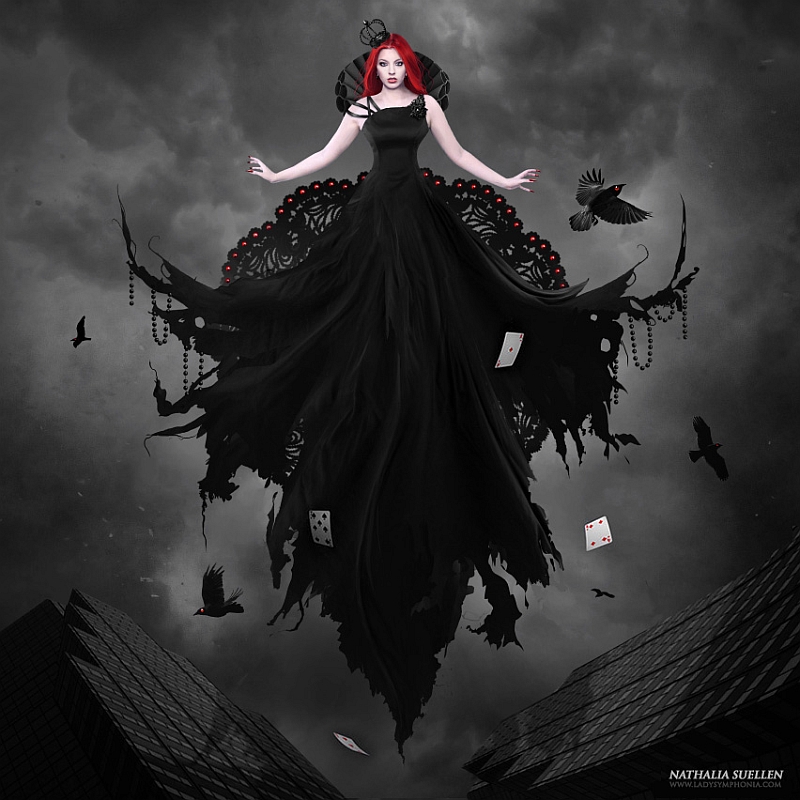
Pierre frente a sus trabajos "La historia de Caos y Nix..." y "Lilith

Pierre Fudarylí es un artista mexicano nacido en noviembre de 1984 en la ciudad de Cancún, Quintana Roo. 
Siempre está experimentando con diferentes técnicas artísticas, con incursiones en la escultura, instalación, fotografía, video, pero con mayor énfasis en la pintura (acrílico, pastel y tinta) y fotomanipulación con software de diseño, tanto 2D como 3D.
Desde una edad muy temprana desarrolló interés en las artes visuales, estudiando independientemente a los grandes maestros de la pintura. A los 11 años intentó tomar clases de pintura, pero abandonó porque no tenía libertad para desarrollar libremente su intelecto, sometido a los prejuicios de un profesor mediocre.

A los 12 años, en un artículo de una revista, encontró al pintor que sería una de sus mayores influencias: Salvador Dalí
El "Corpus Hypercubus" y "Carne de Gallina Inaugural" [ver al final del post] abrieron nuevos horizontes en la mente de Fudaryli, quien más tarde conoció a Remedios VaroMax ErnstChirico y el resto de las personalidades del movimiento surrealista quienes, a diferencia de Caravaggio y Boticcelli, presentaban una realidad distorsionada por la imaginación y el absurdo que, para Pierre, representan el verdadero valor de una obra y su creador.

"Moiras, The Three Fates (Moiras, Las Parcas)" © Pierre Fudarylí

"Animal Playground 6 (Patio de animales 6)" © Pierre Fudarylí
Proyecto "El porno está en el ojo del que mira" (Projecto "Porn is in the eye of the beholder")

El Hurgador: Cuentas que naciste en Cancún, que todo el mundo asocia con el turismo... ¿cómo era el entorno artístico en tu infancia? ¿qué te mueve a inclinarte hacia las artes?

Pierre Fudarylí: En Cancún viví realmente muy poco tiempo, lo cual no representa alguna influencia dentro de mi obra e inclinación por las artes.
Más tiene que ver el entorno familiar y la cercanía con la literatura por medio de los libros de mi padre y la luz que vio mi madre en mi desde pequeño, el apoyo incondicional de ambos y su guía fue lo que me alentó a pensar por mi mismo desde pequeño e ir forjando el habito de dibujar.

EH: ¿Qué te llevó a escoger la arquitectura en vez de dedicarte directamente a estudiar Bellas Artes, por ejemplo?

PF: Principalmente la idea de que un artista muere de hambre antes de cotizarse suficientemente bien para vivir sin problema.
La segunda razón es que en las escuelas te enseñan a pensar como piensa el maestro (cuando menos aquí en México así es) la tercera razón es que son cosas muy afines y complementarias, muchas veces basadas en principios iguales.

"Cromofilia (Chromaphilia)" © Pierre Fudarylí

Cromofilia (afinidad al color)
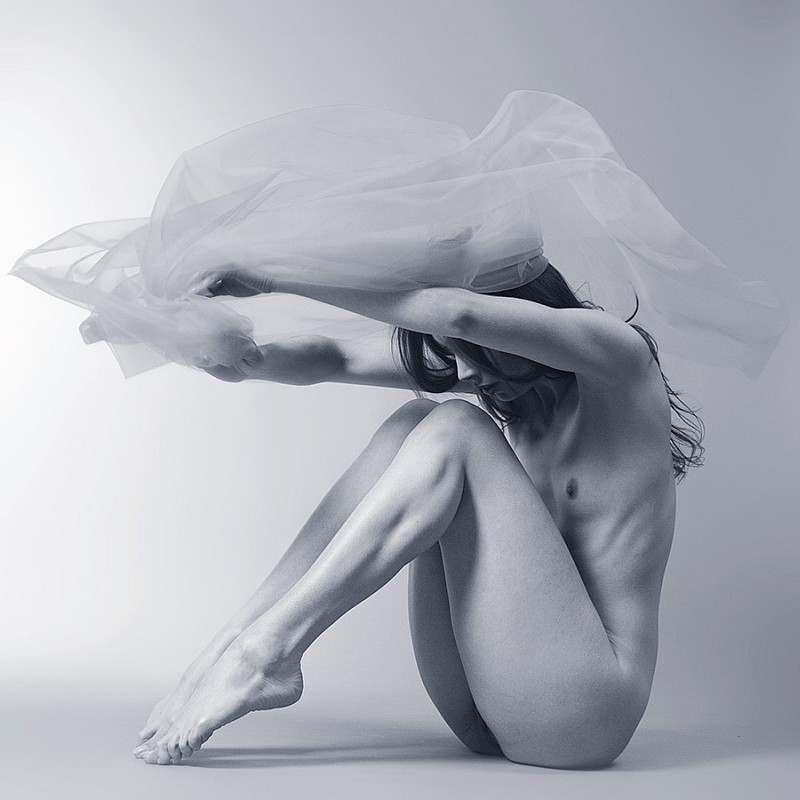
El proyecto presenta la sensualidad intrínseca a la anatomía femenina, sus formas y pliegues, voluptuosidades y contorsiones acentuados por su afinidad a cada sentimiento representado en color.
Chromaphilia presenta a la mujer tal cual es, con una anatomía real cruzando los bordes del estereotipo de "modelo" que ha impuesto Hollywood y sus películas; el cuerpo femenino es perfecto y erótico en la forma que se vea... sus imperfecciones son las que las hacen perfectas, únicas y maravillosas

Izq. "Altar" / Der. "Contemplación (Contemplation)"  © Pierre Fudarylí

"Tratar de comprender el arte es simplemente intentar alimentar el ego para así tener un tema de conversación en la mesa de un café frente a otro pseudointelectual o alguien que quiera reconocer que tú sabes mucho sobre arte."

"Flores para Frida (Flowers to Frida)", set 2 © Pierre Fudarylí

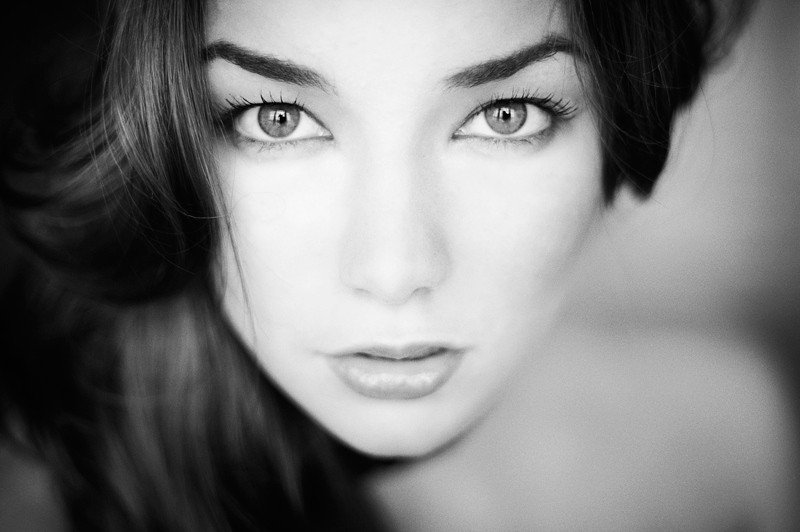
EH: Tienes una predilección especial por la temática femenina, sin embargo las mujeres de tus trabajos suelen aparecer con el rostro oculto o distorsionado. En la selección que hice aquí, por pura casualidad, supongo, sólo en "Ænema" se ve un rostro completo, pero tampoco recuerdo muchos en el resto. ¿A qué se debe?

PF: La censura se debe en parte a la cultura en la que vivo, en parte al propio acuerdo que tengo con las personas que colaboran conmigo pero más allá de eso el despersonalizar un cuerpo hace que cada quien pueda vivir la historia que se cuenta poniéndole su propia cara.

"Lasciate ogni speranza, voi ch'entrate (Abandonad toda esperanza los que entran) 
[All hope abandon, ye who enter in]"
9º de la serie (9th of the series) "errare humanum est, sed perseverare diabolicum" © Pierre Fudarylí

"Ænema" © Pierre Fudarylí

“No se debe racionalizar lo irracional, el estrecho puente entre la maravilla y el miedo es lo que genera la sorpresa visceral entre el arte y el espectador.”

"Lilith" © Pierre Fudarylí

Pierre Fudarylí es a Mexican artist born in November, 1984 in the city of Cancún Quintana Roo.
He is always experimenting with different art techniques, with incursions into sculpture, installation, photography, video, but with more development in the paint (acrylic, pastel and ink) and photomanipulation with design software, both 2D and 3D.
From a very young age, he raises his interest in the visual arts, studying independently from the great masters of painting. At age 11 attempts to take painting classes, but leaves the company because there was not freedom to develop a free intellect, as he was subjected to the prejudice of a mediocre teacher.

At age 12 in a magazine article he found the painter who would be one of his major influences, Salvador Dalí.
The "Corpus Hipercubicus" and "Carne de gallina inaugural” [check at the end of this post] opened new horizons in the mind of Fudarylí, who later knew of Remedios VaroMax ErnstChirico and the rest of the surrealist movement personalities, who unlike Caravaggio and Botticelli, present a distorted reality for the imagination and the absurd, that, for Pierre, represent the true value of a work and its creator.

"Terribilis est locus iste et porta coeli (Éste lugar es maravilloso, las puertas del cielo)
[This is a Place of Awe, The Gate of Heaven]" © Pierre Fudarylí

"Memento mori (Recuerda que eres mortal) [Remember that you must die]"
16º de la serie (16th of the series) "errare humanum est, sed perseverare diabolicum" © Pierre Fudarylí

EH: Yo también vengo de un país americano (Uruguay). Allí, por ejemplo, ha habido tradicionalmente un tratamiento bastante pacato del desnudo, que ha llegado hace no muchos años a la censura abierta de muestras donde aparecían cuerpos sin ropas o en actitudes "incómodas". ¿Cómo te ha tratado México en éste sentido?

PF: En la ciudad donde vivo, Chihuahua, México, me di cuenta de que a raíz de que hago mi trabajo sin miedos de expresarme o experimentar sobre el tema del desnudo mucha gente lo va aceptando más y lo ven como lo que es, arte. Incluso se desencadenó una oleada de personas que comenzaron a quitarse el miedo a experimentar sobre el tema de cualquier lado de la moneda, del lado del fotógrafo o del modelo.
nunca me han censurado o cerrado las puertas, al contrario siempre he recibido apoyo tanto de la universidad donde estudié como de la Universidad Autónoma del Estado, así como de diversos espacios particulares con los cuales estoy muy agradecido.

"La historia de Caos y Nix y la creación de la noche (The tale of Chaos and Nix and the Creation of Night)"
© Pierre Fudarylí

Izq. y Der. "Chromaphilia" © Pierre Fudarylí

"Trying to understand art is simply trying to feed the ego so you can have a topic of conversation in a coffee house table in front of another pseudo-intellectual or someone you want to acknowledge that you know a lot about art."

"Vicarious", acuarela, pastel, tinta china y carboncillo sobre papel, 22 x 57 cm. © Pierre Fudarylí

EH: La temática religiosa está muy presente en tu trabajo; a veces en una puesta en escena abiertamente desafiante (como los desnudos en las iglesias) y en otras, como en la serie "errare humanum est...", con un carácter más "interpretativo", por así decirlo. ¿Cómo es tu relación personal con la religión?

PF: Mi relación con la religión, presente en la mayoría de mi obra es extraña, ya que yo no practico ninguna religión por convicción, sin embargo crecí en un medio donde la mayoría de las personas profesan el catolicismo, estudié en escuelas religiosas en primaria y preparatoria y el arte sacro me parece de las cosas que jamás deberían perderse, no por la carga connotativa sino por la obra misma, la mayoría de las pinturas y espacios religiosos son grandes obras de la humanidad hablando de cualquier religión.
En lo personal me parecen asombrosas muchas de las narraciones de la Biblia, el Bhagavad-guitá y lo poco que he leído sobre el Corán, siempre hacen que me imagine muchas historias, porque para mí no son más que cuentos inventados por los hombres, así que busco ilustrar a mi manera esos cuentos....ya sea criticando las ironías o absurdos descritos o meramente representando sus pasajes.

EH: Además de los clásicos surrealistas que mencionas como referentes que de alguna manera dirigieron tus pasos artísticos, ¿qué artistas actuales te resultan interesantes, por ejemplo en pintura, fotografía y arte digital, ya que tu trabajo es tan variado en cuanto a estilos y técnicas?

PF: En cuanto a influencias hay un artista llamado Cédric Magnin que un día me dijo --"Influences are very important but they become healthy when you forgot them." [las influencias son importantes, pero cuando resultan saludables es cuando las olvidas] esto marcó fuertemente mi separación del formalismo Daliniano, aunque conservo algo de su referencia con significados propios.
Los artistas que más admiro y los cuales se vuelven de cierta manera parte de mi obra son: Max Sauco, Gottfried Helnwein, Dino Valls, Saturno Buttò, Peter Gric, Alex Grey, Arturo Rivera, Siegfried Zademack, Anja Millen, Christian Martin Weiss, Héctor Pineda, Santiago Caruso, Karina Marandjian, hay tantos que no podría terminar de mencionarlos a todos, por otro lado mucho de mi trabajo está inspirado en la musica, así que las referencias también serían necesarias, bandas como Tool, Pink Floyd, Nick Cave y Mars Volta están presentes casi siempre al momento creativo.

"Delta entrópica" - Izq. Obra / Der. Detalle © Pierre Fudarylí

EH: Te declaras enemigo de la racionalización, de la búsqueda de significados y explicaciones que rompan la mística de la relación obra-espectador. Sin embargo tus obras parecen llenas de claves y significados ocultos que parecen buscar ser abordados, descubiertos; símbolos, la propia interpretación religiosa... ¿cómo es posible lo uno sin lo otro?

PF: Me declaro en contra del arte conceptual cuando éste no tiene un valor en si mismo como pieza estética, cuando un concepto es más poderoso que una obra de arte entonces pienso que deberían ser escritores, no artistas plásticos.
Considero que hay dos pasos para apreciar una obra de arte, el primero consiste en la experiencia de observarla y sentirla, ésto es lo más importante, una vez que la pieza te haya causado una reacción visceral cualquiera que ésta sea podrás pasar al siguiente nivel, el cual se convierte en un nivel intelectual, pensar en qué quiso decir el artista.
En mi caso no me gusta explicar mi obra, sin embargo con los títulos invito a la gente a investigar acerca del tema y así tener una segunda experiencia al leer y comprender el cuadro.
Hay experimentos que realizo donde simplemente busco el valor estético de la pieza en sí, por lo regular en las fotografías que no son intervenidas o transformadas.

"Dragonfly" © Pierre Fudarylí

EH: ¿Hacia dónde se dirige tu interés en éste momento, con miras a futuras creaciones? ¿Hay alguna nueva serie temática en la que estés trabajando o que quisieras abordar?

PF: Actualmente estoy desarrollando una serie sobre personajes mitológicos, de todas las mitologías de las cuales me pueda informar, desde los sumerios hasta los mayas, desde los rusos o beduinos hasta los rarámuris o incas. 

Izq. "World Wide Web" / Der. "La Nausée (La Náusea)" © Pierre Fudarylí

“Do not rationalize the irrational; the narrow bridge between the wonder and fear is what creates the visceral shock between art and spectator.”

"Dolor (Pain)", técnica mixta sobre papel. © Pierre Fudarylí

EH: Por último, comenta sobre tí mismo, lo que quieras, que te parezca pueda interesar a quien se interese por tu trabajo.

PF: Todos somos el producto de las cosas que nos rodean, la cosmovisión temporal, onírica y geográfica, no hay nada nuevo, sólo interpretaciones personales de algo que comprendemos distinto.
El plano de los sueños te conduce a la improbabilidad de las cosas y si es improbable me suena a reto, por lo general me gustan los retos.

"Sin título (Untitled)" © Pierre Fudarylí

Los textos complementarios están traducidos de los que aporta Pierre en sus espacios de tumblr y deviantART.
Se puede disfrutar del trabajo de éste artista, además de en los sitios antes mencionados en su facebook.

Complementary texts from Pierre's tumblr site and deviantART. You can enjoy his work also in his facebook.

"Auri Sacra Fames (Detestable hambre de oro) [Detestable Hunger for Gold]"
2º de la serie (2nd of the series) "errare humanum est, sed perseverare diabolicum" © Pierre Fudarylí

Imágenes publicadas con permiso del artista (¡Muchas gracias, Pierre!)
Images published here with artist's permission (Thanks a lot, Pierre!)


Salvador Dalí

"Crucifixion (Corpus Hypercubus)", óleo sobre lienzo, 194,3 x 123,8 cm., 1954. 
Metropolitan Museum, New York

En el cuadro aparece Cristo con un cuerpo atlético y en tensión levitando en la cruz. Gala, la mujer de Dalí, está retratada a sus pies contemplándolo expectante; su tratamiento y sus ropas recuerdan a Zurbarán y Murillo. Al fondo aparece el pueblo gerundense de Cadaqués, el que fuera lugar de veraneo de Dalí y donde ahora está la Casa Museo Salvador Dalí. Sobre este cuadro, en el que emplea un claroscuro barroco, Dalí ha dicho:
"Pinté un cruz hipercúbica en la que el cuerpo de Cristo se convierte metafísicamente en el noveno cubo, siguiendo los preceptos del discurso sobre la forma cúbica de Juan Herrera, constructor de El Escorial, inspirado en Ramón Llull."
Información de Wiki. In english here.

"Carne de gallina inaugural", óleo sobre lienzo, 75,5 x 62,5 cm., 1928.
Fundació Gala-Salvador Dalí, Figueres.


Interview to Pierre Furaylí

El Hurgador: You were born in Cancun, a place that everyone associate with tourism ... How was the artistic environment in your childhood? What moves you to lean toward the arts?

Pierre Fudarylí: In Cancun I lived really very little time, which does not represent any influence in my work and inclination for the arts.
More does the family environment and proximity to the literature through the books of my father and the light mother saw in me since childhood, unconditional support of both of them and their guidance was what encouraged me to think for myself since I was a child and go right from forging the habit of drawing.

EH: What led you to choose the architecture instead of studying Fine Arts, for example?

PF: Mainly the idea that an artist die by starving before quoted well enough to live without problems.
The second reason is that schools teach you to think like a teacher (at least here in Mexico that is) the third reason is that things are very similar and complementary, often based on the same principles.

EH: You have a special fondness for the female subject, however women often appear in your work with face hidden or distorted. In the choice I made here, -by chance, I suppose-, only in "Ænema" looks a full face, but I do not remember many in the rest. What is this?

PF: Censorship is due in part to the culture in which I live, in part due tu agreement that I have with people who work with me, but beyond that depersonalizing the body makes everyone can live the story told by setting their own face.

EH: I also come from an American country (Uruguay). There, for example, has traditionally been quite timid treatment of the nude, which has reached a few years ago to open censorship of artworks where bodies appeared without clothes or in "uncomfortable" attitudes. How has treated you Mexico in this issue?

PF: In the city where I live, Chihuahua, Mexico, I do my job without fear to express or experience on the subject of the nude and I realized that because of that many people will accept more and see it as what it is, art. Even a spate of people who started taking off fear to experiencing at any side of the coin, the side of the photographer or the model.
I have never been censored or closed doors, unlike I have always received support from the university where I studied (Autonomous State University), as well as various private spaces with which I am very grateful.

EH: Religious themes are very present in your work, sometimes in a staging openly defiant (like the naked in churches) and in others, as in the series "errare humanum est ..." with a more 'interpretive' purpose, so to speak. What is your personal relationship with religion?

PF: My relationship with religion, present in most of my work is strange, since I do not practice any religion by conviction, though I grew up in an environment where most people profess Catholicism, studied at religious schools in primary and high school and I think sacred art is one of the things that should never be lost, not because connotative load but for the work itself, most of the paintings and religious spaces are great works of mankind talking about any religion.
Personally, I look amazing many of the stories of the Bible, the Bhagavad-Gita and the little I have read about the Koran, always make me imagine many stories, because to me they are just stories invented by men, so I seek to illustrate my way these stories .... either challenging the ironies or absurds described or merely representing their passages.

EH: Besides the classic surreal as references mention that somehow directed your steps in art, what contemporary artists you find interesting, such as in painting, photography and digital art, regarding that your work is so varied in terms of styles and techniques?

PF: About influences, is there an artist named Cedric Magnin one day he told me: "Influences are very important but they become healthy when you forgot them." this strongly determine my separation of the Dali's formalism, even when I still retain some of their referencies but with my own meanings.
The artists that I admire and which become in some way part of my work are: Max Sauco, Gottfried Helnwein, Dino Valls, Saturno Butto, Peter Gric, Alex Grey, Arturo Rivera, Siegfried Zademack, Anja Millen, Christian Martin Weiss, Hector Pineda, Santiago Caruso, Karina Marandjian, there are so many I could not list them all, on the other hand much of my work is inspired by music, so references would also be necessary, bands like Tool, Pink Floyd, Nick Cave and Mars Volta are almost always present at creative moment.

EH: You consider yourself as an enemy of rationalization, of the search for meaning and explanations that break the mystique of work-spectator relationship. But your works seem full of hidden clues and meanings seem to seek to be addressed and discovered: symbols, religious interpretation itself ... How can be possible one thing without the other?

PF: I declare myself against conceptual art when it has no value in itself as aesthetic piece, when a concept is more powerful than a work of art then I think they should be writers, not artists.
I think there are two steps to appreciate a work of art, the first is the experience of watching and feel it, this is the most important part. Once the artwork have caused a visceral reaction in you, whatever it is, you can move to the next level which becomes an intellectual level, think about what the artist meant.
In my case I don't like to explain my work, however with the titles invite people to research about the subject and get a second experience in reading and understanding the piece.
There are experiments I do simply to find the aesthetic value of the piece itself, usually in the photographs are not taken over or transformed.

EH: Where do you turn your interest at this time, for future creations? Is there any new thematic series in which you are working or want to address?

PF: I am currently developing a series about mythological characters of all mythologies of which I can get information: from the Sumerians to the Mayans, from the Russians or Bedouins until Rarámuris or Incas.

EH: Please comment whatever you want about yourself that you think will interest anyone interested in your work.

PF: All of us are the product of the things around us, the temporal, geographical and dreamlike worldview, there is nothing new, just personal interpretations about something we understand different.
The plane of dreams leads you to the improbability of things and if it improbable sounds me like a challenge, usually I like challenges.


Mick Waghorne [Fotografía]

$
0
0
Mick Waghorne

"Support (Sostén)", Modelo: Kimberley Jane© Mick Waghorne

Mick Waghorne es un fotógrafo residente en Wiltshire, Inglaterra. Según nos cuenta: "Si bien estuve interesado en la fotografía desde la adolescencia, éste interés se desvaneció hasta el desarrollo de la fotografía digital."
En los últimos años se ha centrado en fotografiar desnudos en estudio.
"Me gusta el lienzo en blanco que tengo delante y el desafío de crear algo en conjunto con la modelo que estoy trabajando; la creación de la imagen es bidireccional."

"Floorboards (Tablas del suelo)". Modelo: Kayt Webster-Brown© Mick Waghorne

Izq. "A Swish of the Petticoat (Un giro de la enagua)", 2010. Modelo: Miss Pixie © Mick Waghorne
Der. "On the stand (En posición)", 2012. Modelo: Amie © Mick Waghorne

"Madame Bink 8", 2008. Modelo: Madame Bink© Mick Waghorne

"Durante los últimos años se ha incrementado mi interés por la fusión de la imagen inicial con texturas que he creado de otras fotos que tomé anteriormente. Me gusta el efecto que se produce. No soy un fotógrafo purista y creo que las herramientas están allí para ser utilizadas.
Al final del día es la imagen final lo que importa, no como has llegado hasta ahí; esa es mi filosofía. No es una cuestión sobre cómo empuñar una cámara de manera competente, sino una miríada de cosas."

"Ladies Day (Día de damas)", 2012. Modelo: Suzanne Marshall © Mick Waghorne

"Reach (Alcance)", 2009. Modelo: Raphaella McNamara© Mick Waghorne

Izq. "Ropes (Sogas)". Modelo: Maria Eriksson© Mick Waghorne
"Espirit (Espíritu)". Modelo: Kimberley Jane © Mick Waghorne

"Beauty (Belleza)". Modelo: Monika T© Mick Waghorne

Se puede disfrutar del trabajo de Mick en su sitio web, en 500 px y fundamentalmente en deviantART, con una amplia selección de trabajos.

"Oil and a shirt (Aceite y una camiseta)". Modelo: Sarah Freeman© Mick Waghorne

"Rear View (Vista trasera)", 2011. Modelo: Madame Bink © Mick Waghorne
"Clench (Apretada)", 2012. Modelo: Kimberley Jane © Mick Waghorne

Mick Waghorne is a photographer based in Wiltshire, England. As he wrote: "Whilst I was interested in photography as a teenager this largely waned until the onset of digital photography."
In the last years has focused in shoot of nudes in studio environment.
"I like the blank canvas that I have before me and the challenge of creating something in tandem with the model with whom I'm working. The creation of the image is a two way thing."

"Ghostly (Fantasmal)". Modelo: Kayleigh Lush© Mick Waghorne

"Glued on the wall (Pegada a la pared)", 2009. Modelo: Raphaella© Mick Waghorne

"Head back (Cabeza hacia atrás)", 2008. Modelo: Sarah © Mick Waghorne

"Over the last couple of years I have grown increasingly interested with the fusion of my initial picture with textures that I create from other photos that I have taken. I like the effect that this creates. I'm not a photographic purist and believe that if the tools are there use them. 
At the end of the day it is the final image that matters not how you got there - that's my philosophy. It's not just about being able to wield a camera competently it's a whole myriad of things."

"Euryale", 2010. Modelo: Kayt Webster-Brown © Mick Waghorne

"Pensive (Pensativa)", 2012. Modelo: Suzanne Marshall © Mick Waghorne

"Resurrection (Resurrección)", 2009. Modelo: Raphaella © Mick Waghorne

"Scarf, Stockings and Heels (Pañuelo, medias y tacones)", 2008. Modelo: (Laura) Pirate Maiden 
© Mick Waghorne

You can enjoy Mick's work in his website, in 500 px and specially in deviantART with a wide selection of his works.

"Stone (Roca)", Modelo: Raphaella © Mick Waghorne

Imágenes publicadas con permiso del artista (¡Muchas gracias, Mick!)
Images published here with artist's permission (Thanks a lot, Mick!)

Guido Daniele [Body Painting]

$
0
0
Tal vez muchos de ustedes hayan visto alguna vez trabajos de éste artista ya que se han difundido masivamente en la red desde hace unos años, la mayoría de las veces sin especificar la autoría. Aquí mi propia selección para disfrute de los visitantes...

Maybe many of you have ever seen this artist's work since they have been disseminated in the network massively in recent years, most of the time without specifying authorship. Here my own selection for the enjoyment of visitors ...

Guido Daniele

Guido en un fotograma de la entrevista cuyo video puede verse al final del post.

Guido Daniele es un artista italiano nacido en 1950 en Soverato, (Calabria). 
En 1972 se graduó en la Escuela de Arte de Brera (Milán), en escultura, y luego asistió a la Escuela Tankas en Dharamsala, India, hasta 1974.
Ha trabajado como ilustrador para empresas de edición y publicidad, innovando con el aerógrafo y probando diversas técnicas de pintura.
Desde 1990 se ha especializado en técnicas de body painting que han sido utilizadas para campañas publicitarias y comerciales, así como para eventos y exhibiciones.

"Alce (Elk)", Fotografía: Andric © Guido Daniele

"Leopardo (Leopard)", Fotografía: Andric © Guido Daniele

Lo que realmente ha dado proyección internacional al trabajo de Guido ha sido la pintura de manos, especialmente de animales. Sus "Manimales" han sido utilizados para gran número de campañas publicitarias, como las realizadas para AT&T (tal vez la más espectacular), WWF y otras. Su trabajo busca llamar nuestra atención sobre la alarmante situación de los animales y la naturaleza en general.

"Morena leopardo (Leopard Muray)". Fotografía: Guido Daniele © Guido Daniele

"Cheetah (Guepardo)", Fotografía: Neon Studio © Guido Daniele

"Estudié escultura y me convertí en pintor porque es más directo, es más fácil ir por el mundo con la pintura que con la escultura. Pintar una mano no es difícil para mí, porque estudié una pintura muy delicada en el Tibet e India, así que la miniatura es algo que hago habitualmente. Estudié pintura en el Tibet durante muchos años, y ahora hacer algo muy pequeño es normal para mí, no es tan terrible. No obstante puedo hacer también cosas enormes."

"Campaña AT&T, China, Pandas". Fotografía: Andric © Guido Daniele

"Fabiana". Fotografía: Guido Daniele © Guido Daniele

"Mi cultura es clásica. Estudié en la Academia de Arte Brera en Italia, en Milán, y aprendí cómo esculpir, pintar cosas realmente grandes, pinturas de 400 m²  o cosas muy pequeñas como una mano, o aún más pequeñas. Es algo que depende de mi actividad específica.
Me alegra mucho hacerlo; es algo que todo el mundo puede comprender, especialmente los niños, especialmente la gente sencilla, es un tipo de mensaje muy fácil de comprender en cualquier sitio. Recibo emails de todos los lugares del mundo; desde Australia, Nueva Zelanda, de Sudamérica y de Japón preguntándome acerca de mi arte. Es un arte muy simple, sólo una idea; pintar manos porque tenemos que echarle una mano a los animales, debemos echarle una mano al planeta, para salvar la vida en éste mundo."

"Campaña AT&T, Stonehenge, Inglaterra (AT&T, Stonehenge, England)", Fotografía: Andric © Guido Daniele

"Gallina (Hen)". Fotografía: Guido Daniele © Guido Daniele

La información está tomada de Wiki y del sitio web del artista, donde además se puede disfrutar de una gran variedad de trabajos, videos y artículos.
Los comentarios de Guido están traducidos de la entrevista realizada por Sky News cuyo video puede verse al final de éste post. 

"Perro Dálmata (Dog Dalmatian)". Fotografía: Guido Daniele © Guido Daniele

"Águila calva (Bald Eagle)", Fotografía: Neon Studio, © Guido Daniele

Daniele Guido is a Italian artist born in Soverato, Calabria in 1950. 
In 1972, he graduated from Brera School of Arts, majoring in sculpture and then attended the Tankas school in Dharamsala, India until 1974.
Daniele has worked as a hyper-realistic illustrator, co-operating with editing and advertising companies, innovating with airbrush and testing out various painting techniques. He has painted backcloths up to 400 square meters in size. He has also painted trompe l'oeil images for private houses and public buildings. In 1990, he developed a body painting technique, and his work has been used in advertising images and commercials, as well as fashion events and exhibitions.

"Burkí". Fotografía: Guido Daniele © Guido Daniele

"Cebra, fondo negro (Zebra on black)", Fotografía: W. D. Búttcher, © Guido Daniele

"Para la revista AMICA (For AMICA Magazine)", Fotógrafo: Douglas Kirkland, 2012

What really has gave international recognition to the work of Guido has been hand painting, especially animals. His "Handimals" have been used for a large number of advertising campaigns, such as those made for AT & T (perhaps the most spectacular), WWF and others. His work seeks to draw our attention to the alarming situation of animals and nature in general.

"Kohyo, Japón". Fotografía: Guido Daniele © Guido Daniele

"Crocodile (Cocodrilo)". Fotografía: Guido Daniele © Guido Daniele

"I studied sculpture and I became painter because is more direct, is more easy to go around the world with painting than with sculpture. To paint one hand is not so difficult for me because I sudied many delicate painting in Tibet and India so miniature for me is something I used to do. I was studying Tibetan painting for many years and now make something very small is quite normal for me, is not so terrible. But anyway I can do something very big too."
"Cristiane". Fotografía: Antonella Pizzamiglio © Guido Daniele

"Iguana", Fotografía: Andric, © Guido Daniele

"Pato mandarín (Mandarin Duck)". Fotografía: Guido Daniele © Guido Daniele

"My culture is classic. I sudied in Academy in Italy, in Milano, and I learned how to do sculpture, painting very big, 400 m² painting, or very small like one hand or maybe smaller. Is something depending on my specific activity.
I'm very happy to do, is something everybody understand, specially the children, specially the simple people, so is a kind of message very easy to understand everywhere. 
I receive emails from everywhere in the world, from Australia, from New Zealand, from South America, from Japan and they ask me about this art. This art is very simple, is just one idea to paint hands because we must give one hand to the animals, must give one hand to this world, to save the life in this world."

"Pitón real (Royal Python)". Fotografía: Guido Daniele © Guido Daniele

"Cisne coscoroba (Coscoroba Swan)". Fotografía: Guido Daniele © Guido Daniele

Information from Wiki and artist's website, where you can also enjoy a wide selection of works, videos and articles about Guido.
Artist's comments from the interview to Sky News whose video you can see at the end of this post. 


El actor Ralf Moeller con un delfín de Guido pintado en su mano, en la apertura de "Guido Daniele - Animal Hand Painting" en el Dom Aquaree (Febrero 19, 2009), en Berlín, Almeania. Moeller es un enamorado de los delfines y colabora con "DOLPHINE AID", una organización que ayuda a niños con problemas mediante la terapia con delfines. Fotografía de Sean Gallup/Getty Images

Actor Ralf Moeller poses with his hand painted like the head of a dolphin by Italian artist Guido Daniele at the opening of "Guido Daniele - Animal Hand Painting" at the Dom Aquaree on February 19, 2009 in Berlin, Germany. Moeller is a dolphin enthusiast and testimonial of "DOLPHINE AID", a charity association who help child with problems, with "dolphin-therapy". Photo by Sean Gallup/Getty Images.

"Delfín (Dolphin)". Fotografía: Guido Daniele © Guido Daniele

Imágenes publicadas con permiso del artista (¡Muchas gracias, Guido!)
Gracias también a Ruben por los enlaces y las sugerencias para hacer éste post.

Images published here with artist's permission (Thanks a lot, Guido!)
Thanks also to Ruben for the links and his suggestions to make this post.


Un excelente video en que podemos ver a Guido en acción, en el backstage de la campaña para Toy Watch.
Excellent video where you can see Guido working in the backstage for Toy Watch campaign.


___________________________________________________________

Entrevista / Interview, Richard & Judy London TV, England


____________________________________________________________

Entrevista en Sky News - Harrods Interview


._______________________________________________________________________

AT&T Internationl Roaming: Cómo se hizo la campaña publicitaria "Manos"
AT&T International Roaming: Making of "Hands" Commercial


Rinocerontes (XL)

$
0
0
Templo Lakshmi, Bakhtapur, Nepal

Rinoceronte en el Templo Lakshmi. Fotografía de aquí.

Bhaktapur es una ciudad ubicada a una hora en bus desde Kathmandu, en Nepal. Su plaza central, la Durbar Square, homónima de la de Kathmandú, está flanqueada de templos, entre los cuales se encuentra el de Siddhi Lakshmi en cuyas escaleras encontramos, entre otras figuras de animales en piedra, a éste bonito rinoceronte.

Escalinata del Templo Lakshmi en Durban Square, Bhaktapur. Fotografía de aquí.

Bhaktapur is a town located about an hour away (by bus) from Kathmandu. Its Durbar Square has numerous temples, like the Siddhi Lakshmi Temple in whose stairs are flanked by animal sculptures, like this rhino.


James Guppy

"Rhinocerus Tea" © James Guppy
Izq., obra original, acrílico sobre lino, 137 x 91 cm., 2009 / Der., estudio, acrílico sobre lino, 45 x 30 cm.

James Guppy es un pintor y fotógrafo australiano de quien publiqué no hace mucho un post repasando su obra, al cual me remito para más información.

James Guppy is an Australian photographer and painter who not long ago I published a post reviewing his work, to which I refer for more information.

"The Trophy (El trofeo)", acrílico sobre lino, 30 x 96 cm., 2009 © James Guppy

Más sobre James Guppy en "El Hurgador" / More about James Guppy in this blog: [James Guppy (Pintura)]


Saverio Polloni

 "Rhinoceros unicornis", 100 x 100 cm., 2010 © Saverio Polloni

También sobre Saverio Polloni publiqué hace un tiempo una selección de sus trabajos que recomiendo a quienes gusten éstos hermosos rinocerontes que me había reservado oportunamente...

 © Saverio Polloni

I've published also some time ago a selection of Saverio Polloni's work that I recommend to those who enjoy these beautiful rhinos...

Más sobre Saverio Polloni en "El Hurgador" / More about Saverio Polloni in this blog: [Saverio Polloni (Pintura)]


Ronnie Wood

"Rhino"

Ronald David "Ronnie" Wood, además de ser el archifamoso integrante del grupo de Jeff Beck "Faces", y miembro de los Rolling Stones desde 1975, es un conocido artista visual. Cuando era un niño, sus dibujos fueron presentados en el programa de televisión de la BBC "Sketch Club" donde ganó uno de los concursos, hecho al que él ser refiere como su "despertar artísitico". Estudió en el Ealing Art College, al igual que sus dos hermanos, y también con Freddie Mercury (Queen) o Peter Townshend (The Who) quienes también asistieron allí en los años '60.
Las pinturas, dibujos e impresiones de Wood frecuentemente representan iconos de la cultura popular, y han sido exhibidas por todo el mundo.
Pero es que además durante varios años, Ronnie se ha comprometido con las especies amenazadas en África, concretamente con el Rinoceronte Blanco. Ha contribuído en la creación de un refugio para la protección de éstos animales. Y también lo tenemos aquí, con uno de sus trabajos artísticos.


Ronald David "Ronnie" Wood is an English rock musician best known as a former member of the Jeff Beck Group, Faces, and a member of the Rolling Stones since 1975, but besides is a well-known visual artist. When he was a child his drawings were featured on the BBC television programme Sketch Club; he won one of that programme's competitions, an achievement he refers to as his "awakening to art". He went on to train at the Ealing Art College, as both his brothers had. Other notable musicians, Freddie Mercury of Queen, and Pete Townshend of the Who, also attended in the 1960s.

Wood's paintings, drawings and prints frequently feature icons of popular culture and have been exhibited all over the world.
But also or several years Ronnie Wood has been a champion of the endangered African White Rhino. This interest has gone far beyond celebrating these amazing but threatened animals, as Ronnie has contributed to the creation of a refuge designed to protect them from poachers. Here you have one of his artworks depicting a rhino.


Adam Wawrzyniak

 © Adam Wawrzyniak

No hay información de éste fotógrafo polaco, pero encontré sus álbumes que incluyen ésta bonita estampa aquí y también aquí.

Virtually no information about this Polish photographer, but I found his portfolios with this beautiful image here and here.


ROA en Johannesburgo

Mural de ROA en Johanesburgo. Fotografía de aquí.

ROA es un artista urbano belga que generalmente pinta grandes murales con los animales (muchas veces muertos) como temática preponderante. El presente trabajo fue realizado para el evento ART Joburg, realizado en Johanesburgo en 2012, y presenta 6 animales característicos, entre ellos el rinoceronte.
El sitio web de ROA aquí.

Fotografía de aquí.

ROA is a Belgian street artist usually paints large murals with animals (often dead) as the dominant theme. This work was done for ART Joburg event, held in Johannesburg in 2012, and features 6 distinctive animals, including rhinoceros.
ROA's website here.

El artista trabajando en el mural. Fotografía de aquí.


Zamość Zoo

Fotografía de aquí.

Zamość (en latín: Zamoscia) es una ciudad del sureste de Polonia con 66,633 habitantes (2004), situada en el Voivodato de Lublin (desde 1999). A alrededor de 20 kilómetros de la ciudad se encuentra el Paque Nacional de Roztocze.
El centro histórico se incluyó en la lista de ciudades Patrimonio de la Humanidad de la Unesco (en 1992).
La fotografía es de la entrada al Zoo de la ciudad, con un simpático rinoceronte.
Info in english here.


Reid Park Zoo, Tucson
Rinoceronte para ciegos

Fotografía de aquí.

Otra escultura de un rinoceronte blanco, ésta vez en el Reid Park Zoo de Tucson, Arizona (USA)

Ésta es una de las muchas diseñadas para que los discapacitados visuales aprendan sobre los animales del zoo. Éstas esculturas están diseñadas para ser tocadas y cada una de ellas incluye información en braille en una placa.
Como las otras, la pieza es algo menor de un pie de ancho, alrededor de 9 pulgadas de alto y está instalada en un pilar de 4 pies, a una altura que está al alcance de la mano de los visitantes.
Información e imágenes de aquí


The Bronze for the Blind Rhino is located at Reid Park's Zoo, and is one of several sculptures designed for the visually impaired to learn about zoo animals. These sculptures are intended to be completely hands-on, and each one includes an informational plaque that includes braille lettering. 
Like the others, the art piece is a little over a foot wide, about 9 inches tall, and is on top of a 4-foot pillar, at a hands-on height for visitors. 
Info and images from here.


Museo de Historia Natural, NYC

Fachada del Museo de Historia Natural. Fotografía de aquí.

Flanqueando la fachada, esculturas en bajorrelieve creadas en 1936 por Edward Field Sanford Jr., que representan 18 animales incluídos leones, panteras, cebra, rinoceronte, alce, lobos, osos grizzly y un ciervo en una terraza de 126 pies de largo que también incluye la estatua de Theodoro Roosevelt realizada por James Earle Fraser. Información de aquí.

Flanking the façade, bas-relief sculptures created in 1936 by Edward Field Sanford, Jr., depict 18 animals including lions, panthers, zebra, rhinoceros, moose, grizzly bears, wolves, and deer on a 126-foot-long terrace that also includes a bronze statue of Theodore Roosevelt by James Earle Fraser.
Info from here.

Detalle de los bajorrelieves. Fotografía de aquí.

Julia Kirsanova [Fotografía]

$
0
0
Julia Kirsanova
Юлия Кирсанова


Julia Kirsanova es una jóven fotógrafa rusa que últimamente ha tenido difusión en la red gracias a sus hermosos retratos, obras que transmiten una gran calidez y naturalidad. Trabaja desde San Petersburgo y, como ella misma cuenta, es una "ávida y entusiasta" de la fotografía desde que descubrió sus posibilidades.
A continuación, una selección de sus trabajos.

 © Julia Kirsanova

 © Julia Kirsanova

 © Julia Kirsanova

"Todo comenzó hace unos tres años, cuando por primera vez tuve en mis manos una cámara digital y comencé mis algo torpes intentos de fotografiar prácticamente todo lo que me rodea: objetos, personas, sus vidas, colores, movimientos y pasiones. Sentí como una bocanada de aire fresco que me hizo sentir de una manera diferente, como nunca antes. Todo a mi alrededor parecía haber recobrado súbitamente la capacidad (como en mi lejana niñez) de infundirme un sentimiento de algo brillante, sorprendente y absolutamente delicioso de experimentar, algo que estaba dentro de ellos, esperando ansiosamente a que lo redescubriera. Comencé a prestar más atención a la gente, sus gestos, el aspecto de sus rostros y a sus ojos, y busqué expresarlo en mis fotos."

 © Julia Kirsanova

 © Julia Kirsanova

 © Julia Kirsanova

"Y ahora la fotografía ocupa un lugar muy especial en mi vida y la forma en que abordo a la gente que me rodea. Siempre estoy intentando expresar lo que hay dentro de las personas a las que fotografío, descubrir su belleza interior, y seguir recordando a todo el mundo que son especiales y únicos, cada uno a su manera."

 © Julia Kirsanova

 © Julia Kirsanova

Los comentarios están traducidos del texto que amablemente me remitió Julia.
Se puede disfrutar de muchos más trabajos en su sitio web, en 500px, en vk (en ruso) y en su facebook.

 © Julia Kirsanova

 © Julia Kirsanova

Julia Kirsanova is a young Russian photographer whose beautiful portraits has recently been disseminated on the net. Her works conveys warmth and naturalness.
Julia is based in St. Petersburg and as she said, is an "avid and enthusiastic" of photography since discovering its possibilities.
Below you can enjoy a selection of his photographs.

 © Julia Kirsanova

 © Julia Kirsanova

 © Julia Kirsanova

"...It all started about three years ago, when I first touched a digital camera and made my first and somewhat awkward attempts at taking pictures of virtually everything around me: objects, people, their lives, colors, movements and passions. It felt like a gulp of fresh air, which made me feel in a different, like never before. Everything around me seemed to have suddenly regained the ability to, like in long gone childhood before, give me a feeling of something sparkling, amazing, and quite delightful to experience, was inside of them, and yet eagerly awaiting me to discover it once more. I started to pay closer attention to people, their gestures, looks on their faces, and eyes, and I sought to express them in my photos."

 © Julia Kirsanova

 © Julia Kirsanova

 © Julia Kirsanova

"And now photography takes a very special place in my life, and the ways I am talking to people around me. I'm always trying to express what's on the inside of people who I take pictures of, discover their inner beauty, and to keep reminding everyone that they're special and unique, each in their own way."

 © Julia Kirsanova

You can enjoy a lot of works in her website, in 500px, in vk (in Russian) and her facebook.

 © Julia Kirsanova

Imágenes publicadas con permiso de la artista (¡Muchas gracias, Юлия!)
Images published here with artist's permission (Thanks a lot, Юлия!)

Edward Lear [Litografías, Loros]

$
0
0
Edward Lear
"Ilustraciones de la Familia Psittacidae, o Loros
(Illustrations of the Family of Psittacidae, or Parrots)", 1832


Edward Lear (12 de mayo de 1812 - 29 de enero de 1888) fue un escritor, ilustrador y artista británico conocido por su poesía sin sentido y sus limericks (poesías humorísticas breves, de cinco líneas, en las que las dos primeras y la última riman).
Nació en Highgate, un suburbio de Londres, siendo el vigésimo hijo. Fue criado por una hermana veintidós años mayor que él. A la edad de 15 años, él y su hermana dejaron la casa familiar para independizarse. 

Calyptorhynchus Baudinii

Prosopeia (ant. Platycercus) Tabuensis

Lear empezó a trabajar como ilustrador y su primera publicación fue "Illustrations of the Family of Psittacidae, or Parrots (Ilustraciones de la Familia Psittacidae, o Loros)" en 1832 ; 42 pinturas de loros en estampas litográficas presentadas como un libro que empezó a pintar con apenas 18 años. Se hicieron 175 copias de las cuales cerca de 100 llegaron hasta nuestros días. Pintó loros vivos en el Zoo de Londres y algunos de colecciones privadas. La calidad de sus pinturas de loros le granjearon una reputación como uno de los mejores artistas de historia natural de su tiempo; fueron comparadas incluso con las del naturalista John James Audubon.
Se pueden ver la totalidad de las láminas en Wikimedia Commons. Datos de la obra traducidos de aquí.


Cacatua moluccensis (ant. Plyctolophus rosaceus)

Lorius domicellus

Durante el resto de su vida realizó dibujos serios aunque se hizo famoso por sus obras humorísticas. En 1846 publicó A Book of Nonsense, un volumen de limericks que se reeditó tres veces y que ayudó a la popularización de este tipo de poesías. En 1865 publicó The History of the Seven Families of the Lake Pipple-Popple, y en 1867 publicó su más famosa obra absurda, The Owl And The Pussycat, que escribió para los hijos de su jefe, Edward Stanley, conde de Derby.
Lear nunca tuvo buena salud. Desde los 17 años hasta su muerte sufrió epilepsia (le grand mal) así como bronquitis, asma y, en la vejez, ceguera parcial.

Cyanoramphus (ant. Platycercus) unicolor

Platycercus icterotis (ant. Stanleyii)

Edward Lear (12 May 1812 – 29 January 1888) was an English artist, illustrator, author and poet, and is known now mostly for his literary nonsense in poetry and prose and especially his limericks, a form he popularised. His principal areas of work as an artist were threefold: as a draughtsman employed to illustrate birds and animals; making coloured drawings during his journeys, which he reworked later, sometimes as plates for his travel books; as a (minor) illustrator of Alfred Tennyson's poems. As an author, he is known principally for his popular nonsense works, which use real and invented English words.

Cacatua sulphurea (ant. Plyctolophus sulphureus)

Ara Macao (ant. Macrocercus Aracanga)

Nymphicus hollandicus (ant. Paleornis Novae-Hollandiae)

Lear's first publication, published when he was 19 years old, was Illustrations of the Family of Psittacidae, or Parrots in 1832;  42 paintings of parrots as lithographic plates bound together as a book. A total of 175 books were made of which about 100 survive today. He painted live parrots at the London Zoo and some in private collections. The quality of his paintings of parrots established his reputation as one of the best natural history artists of his time; he was compared favourably with the naturalist John James Audubon.
You can check all the 42 plates in Wikimedia Commons. Info about the book here.

Aprosmictus (Platycercus) Erythropterus

Ara (Macrocercus) Ararauna

Purpureicephalus spurius (ant. Platycercus pileatus)

(Polytelis anthopeplus (ant. Palaeornis melanura)

Viewing all 2069 articles
Browse latest View live